Mastercard
Work


Brand identity to emphasize simplicity, connectivity and seamlessness.
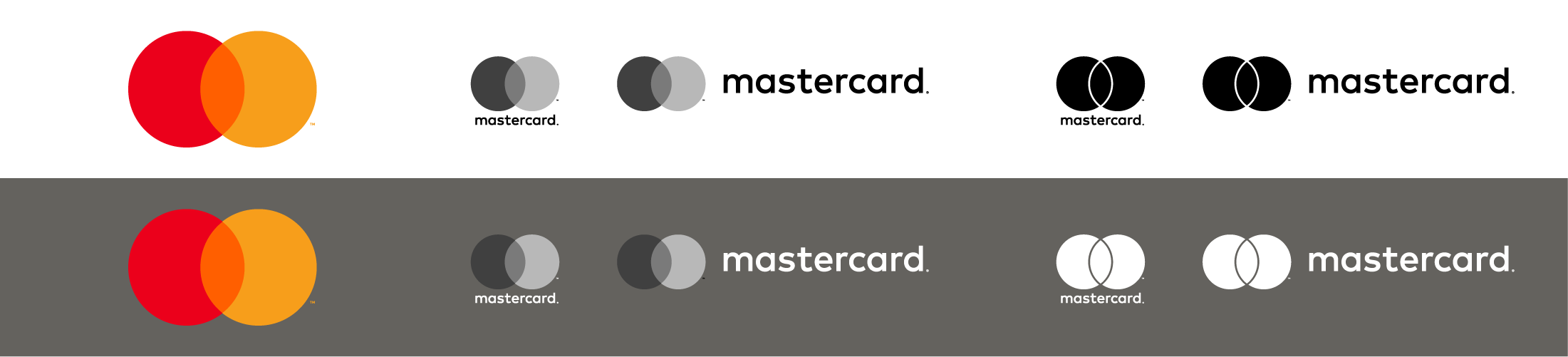
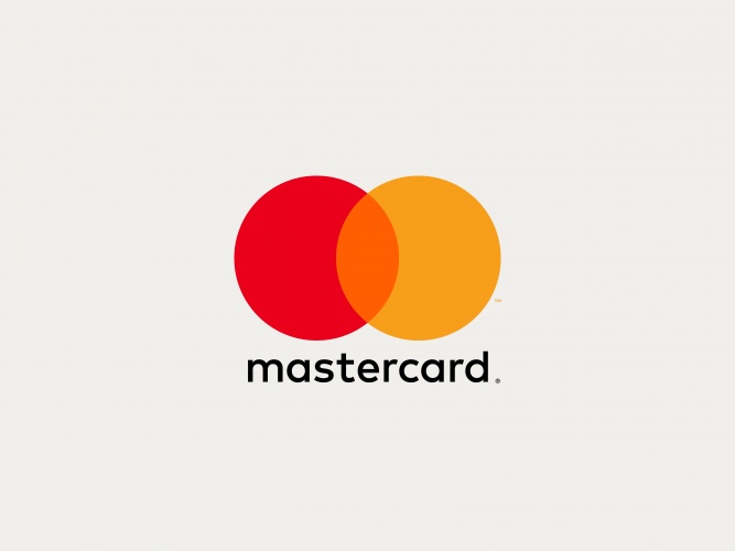
The iconic red and yellow intersecting circles of Mastercard are one of the world’s most recognized brands. Today the company launches an evolution of its brand identity featuring a new mark that highlights the connectivity and seamlessness of Mastercard and its payment systems. Designed by Pentagram, the identity brings simplicity and clarity with an increased emphasis on the interlocking circles, and is optimized for use in digital contexts, an increasingly important part of Mastercard’s business.
The Pentagram team collaborated closely with Mastercard leadership on the project, including Raja Rajamannar, Chief Marketing and Communications Officer. The goal was to convey simplicity and modernity, while preserving the company’s heritage and enormous brand equity. Digital technology is a growing segment of Mastercard’s business, and it needed an identity that would help position the brand as a forward-thinking, people-centered technology company. The new mark is designed to work seamlessly across all digital platforms, retail channels and connected devices.
“Today, it is all about connected-consumers, and digital is at the heart of enabling practically everything they do in all spheres of their lives,” says Rajamannar.
The new logo represents both Mastercard the company and the full suite of Mastercard products and services, creating a single brand system for the entire organization as well as its existing and future products. This replaces a 2006 version of the logo that was meant to distinguish Mastercard corporate from the consumer-facing image. The new brand mark will be used across every touchpoint of the Mastercard brand, from the cards carried by consumers, to signage at Mastercard headquarters, to the digital payment system on smartphones.
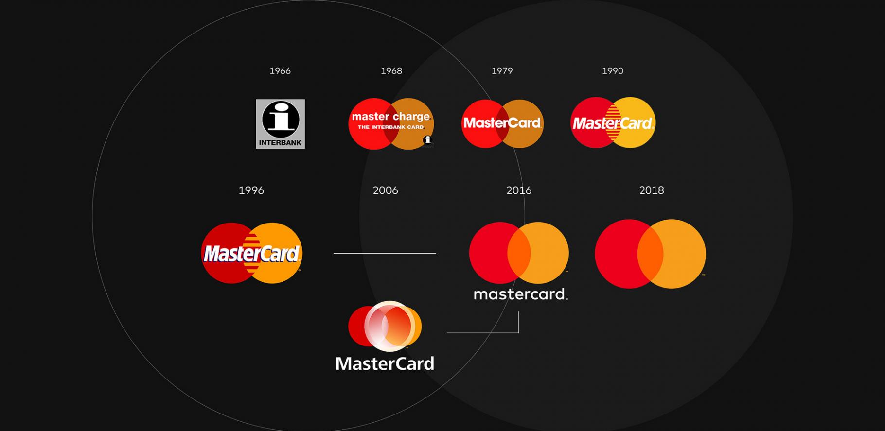
To create the new symbol, the designers isolated the brand’s elements to their purest form. From the very beginning, in 1968, Mastercard’s brand mark has relied on extraordinarily simple elements: two interlocking circles in red and yellow. The overlapping forms effortlessly express the idea of connection, while the basic circular shapes suggest inclusiveness and accessibility, key to Mastercard’s brand message of “priceless possibilities.” The new brand mark preserves and builds on this iconic foundation, providing a crisper look that has flexible configurations more suited for digital applications.
To date, over 2.3 billion cards around the world have been issued with an existing Mastercard brand mark, and millions of merchants display the Mastercard acceptance mark. The simplicity of the new mark allows it to co-exist with these older iterations as the various brand expressions are updated and implemented, starting with Masterpass, the digital payment service, which will introduce the new identity this month. In global market research for the mark, Mastercard found that an astonishing 81 percent of consumers spontaneously recognized the new symbol without the inclusion of the Mastercard brand name.
The entire identity is built using the core elements found in the logo: geometry and color. A new set of graphic tools have been developed to help Mastercard communicate effectively and concisely in all media. The tools consist of a distinctive color palette, a new typographic system, and pure graphic shapes with parameters that enable the creation of an infinite series of varied yet connected graphic patterns. In addition, custom icon sets, illustrations and photographic styles have been established to create a consistent visual system to express a wide range of messages.
One of the subtle changes was to lowercase the “c” in the wordmark, as a visual cue to de-emphasize how the brand is no longer just a card in consumers’ wallets, and will continue to give way to other forms of payment in the digital world. The lowercase typography is in line with the simple and modern approach, and allows for a consistent treatment in names of products such as Masterpass.
The wordmark is set in the contemporary sans serif FF Mark. During its research, the team looked back to a version of the logo used in 1979, which featured typography with a circular structure. The new typography plays on the perfectly circular forms of the mark, with rounded letterforms that each contain a portion of the circle (even “m” and “t”).
Getting the three colors in the mark right was a challenge for the designers, requiring hundreds of tests to find the perfect hues that would work successfully in every conceivable context. The logo needed to work on white backgrounds, black backgrounds, and different values in between. This meant that the colors had to be carefully calibrated, so they would stand out and not disappear, and have sufficient contrast from the orange in between.
In the final mark, the color of the overlap is both lighter than the red and darker than the yellow, suggesting that the two circles are translucent, rather than solid, giving the brand a feeling of transparency. The original Mastercard logo used a subtractive color mix: when the red and yellow circles overlapped, they created a darker color. The new symbol uses an additive mix—the colors now produce a brighter orange. This projects an overall effect that is lighter and fresher, giving the symbol a subtle glow and a bolder, more optimistic feel.
In applications, the graphic elements complement the typography and are built parametically around mathematical principles found in the mark. Coupled with the power of computing, the parametric design generates infinite arrangements, each different from the next, though all part of the same visual system.
The complete color palette is built from scales surrounding the red and yellow of the logo. The use of warm greys, both dark and light, as the base for all compositions ensures neutrality. Orange is the new primary color, a perfect midpoint between red and yellow.
Source: https://www.pentagram.com