Yo Sushi
YO! Sushi—Brand -Branding for restaurant chain YO! Sushi. An updated logo together with extensive brand guidelines.
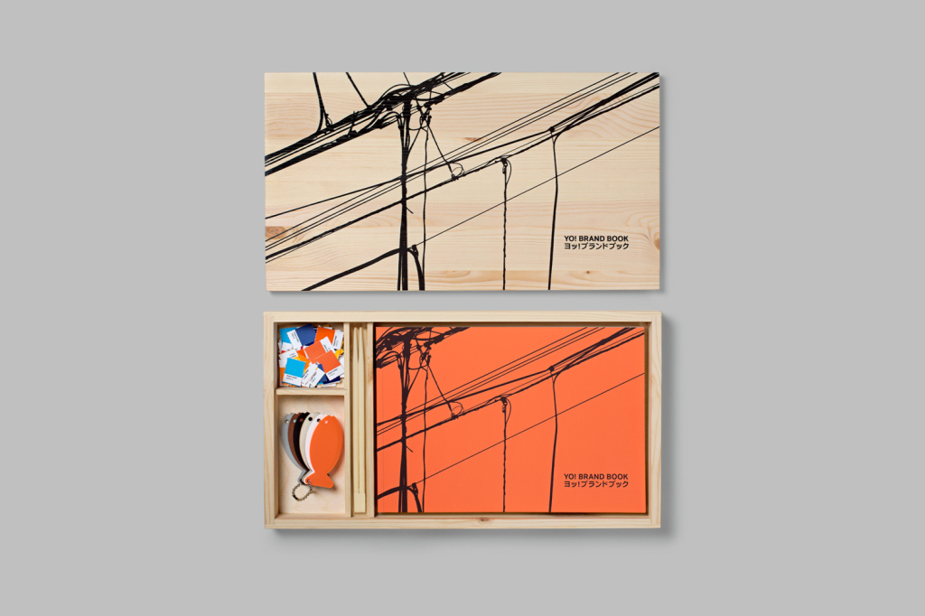
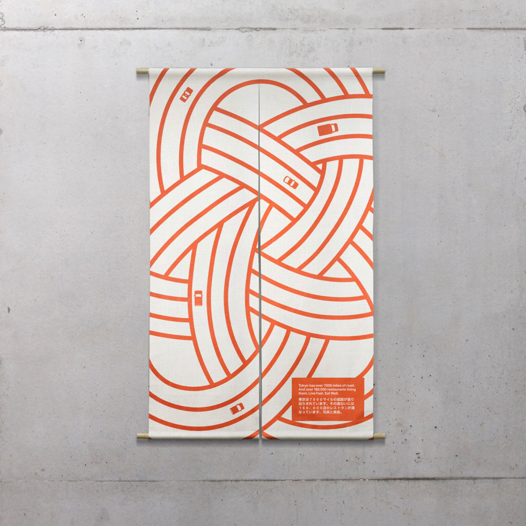
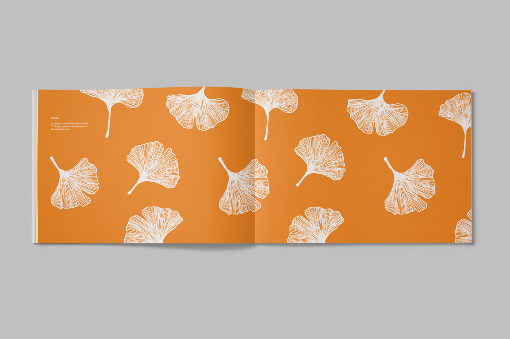
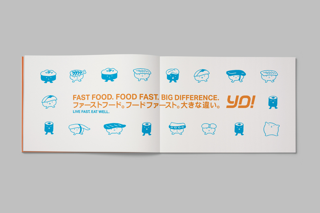
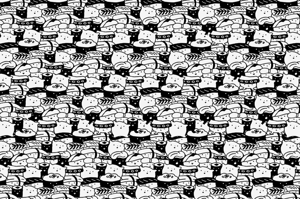
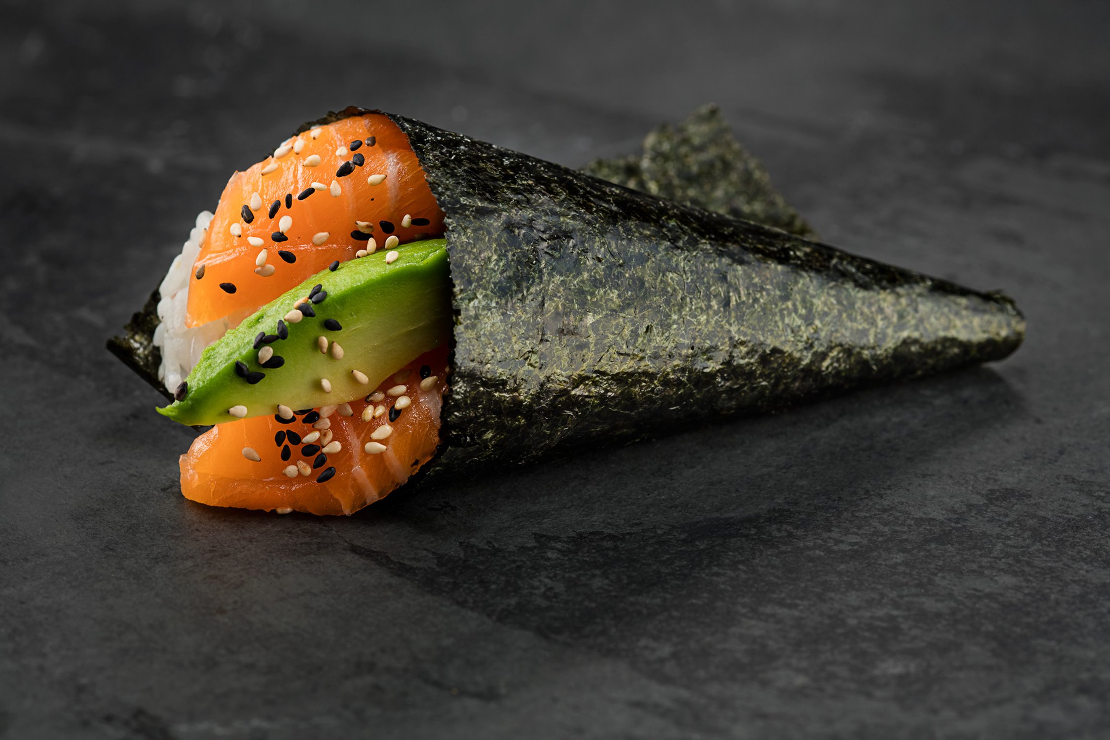
At the core of the rebrand is a 200 page brand book, presented in a bespoke Japanese bento box. The guidelines include an eclectic mix of graphic assets referencing iconography from Tokyo.Design/Agency: Paul Belford Ltd.
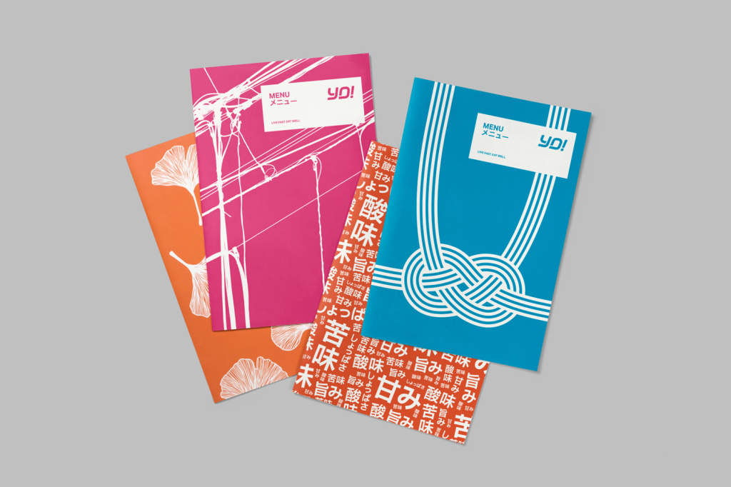
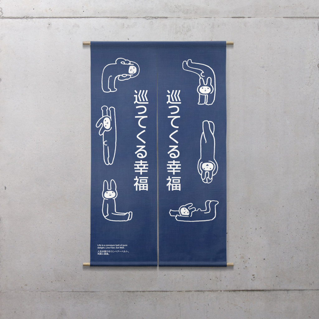
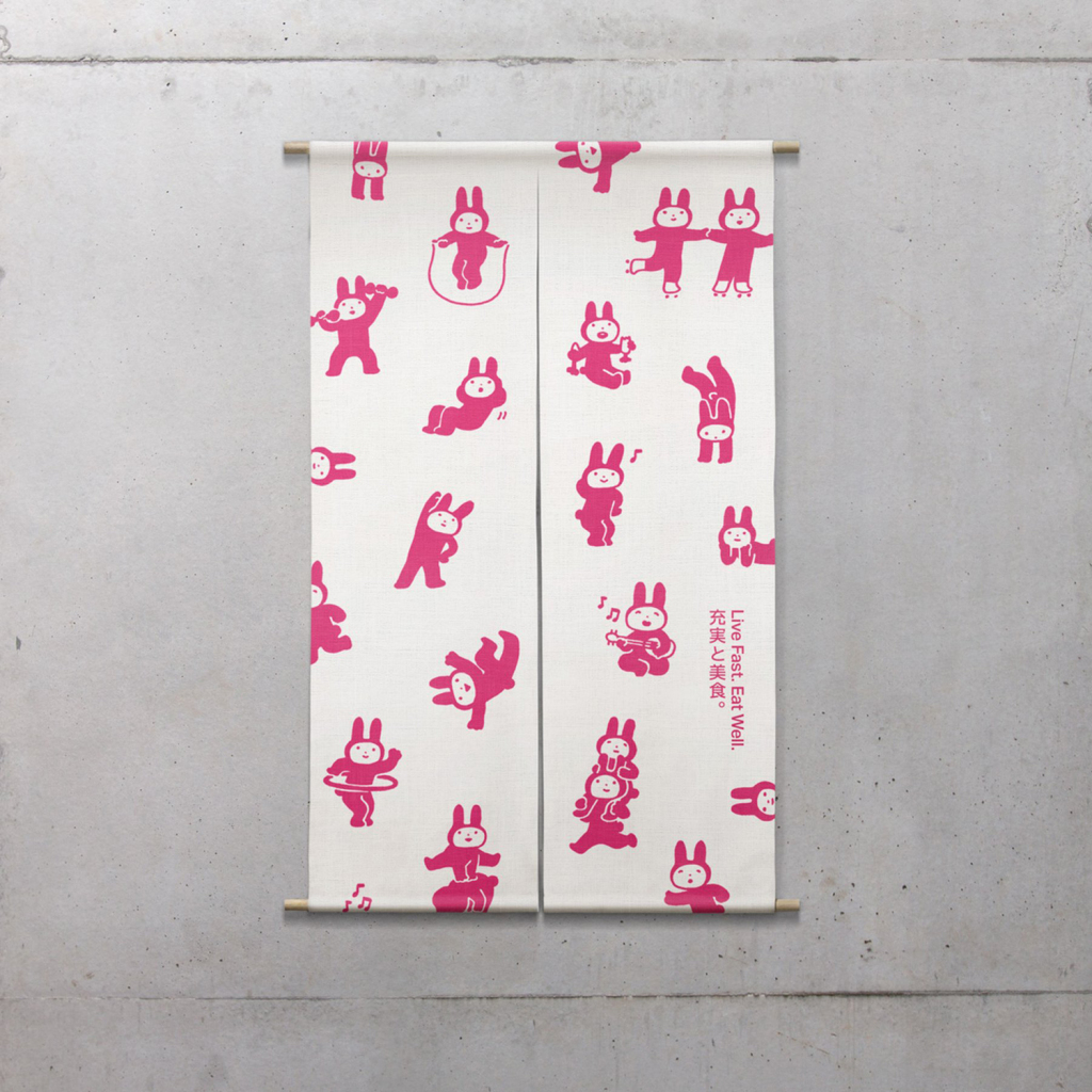
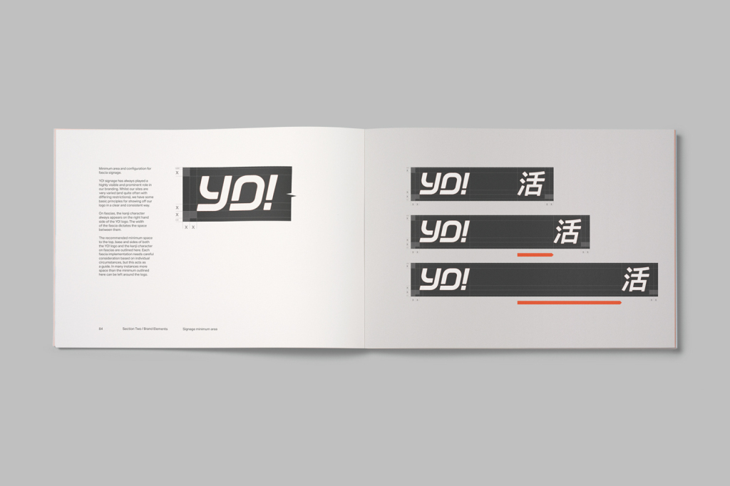
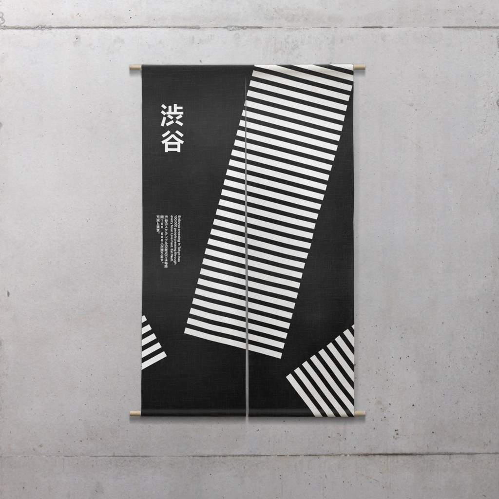
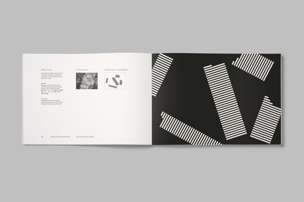
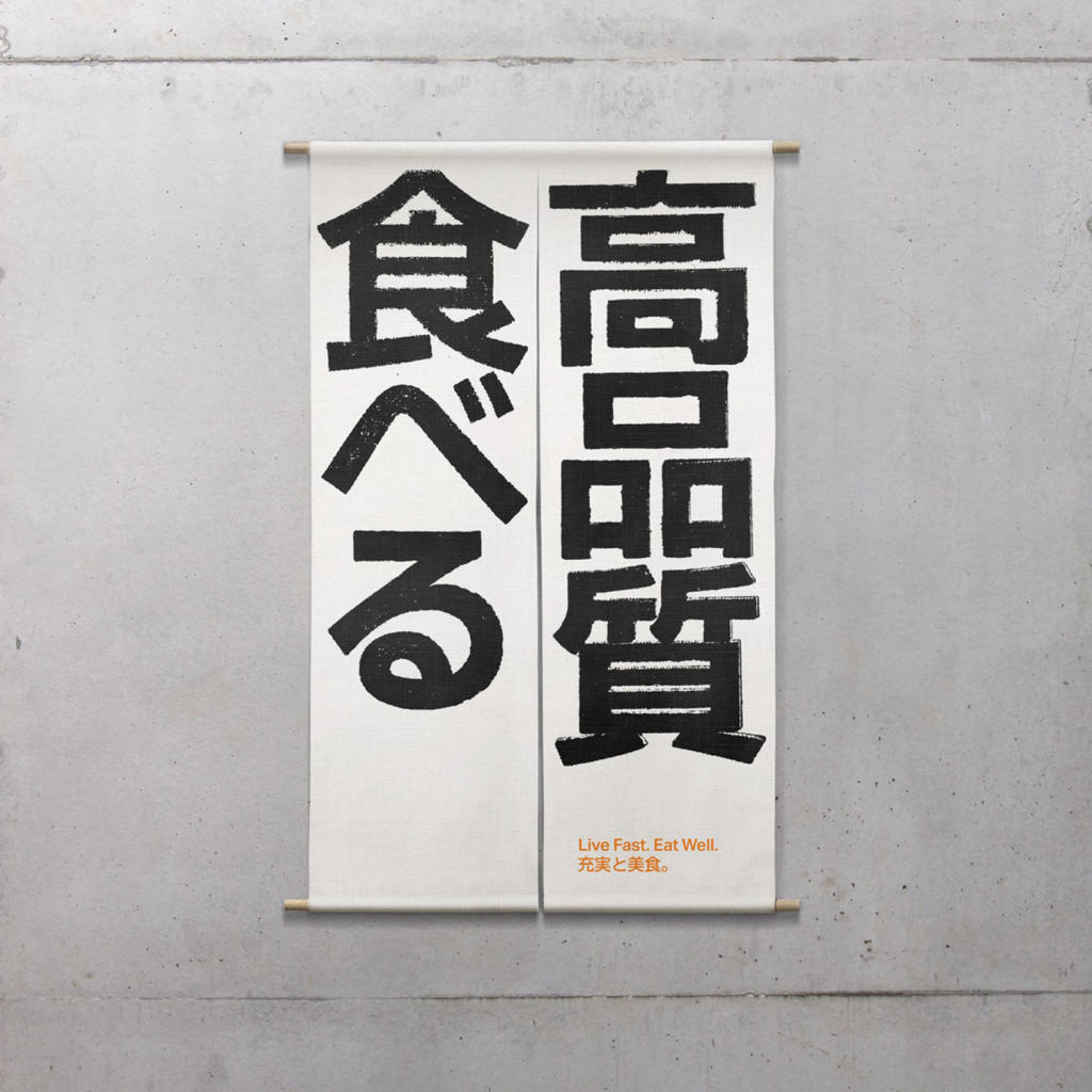
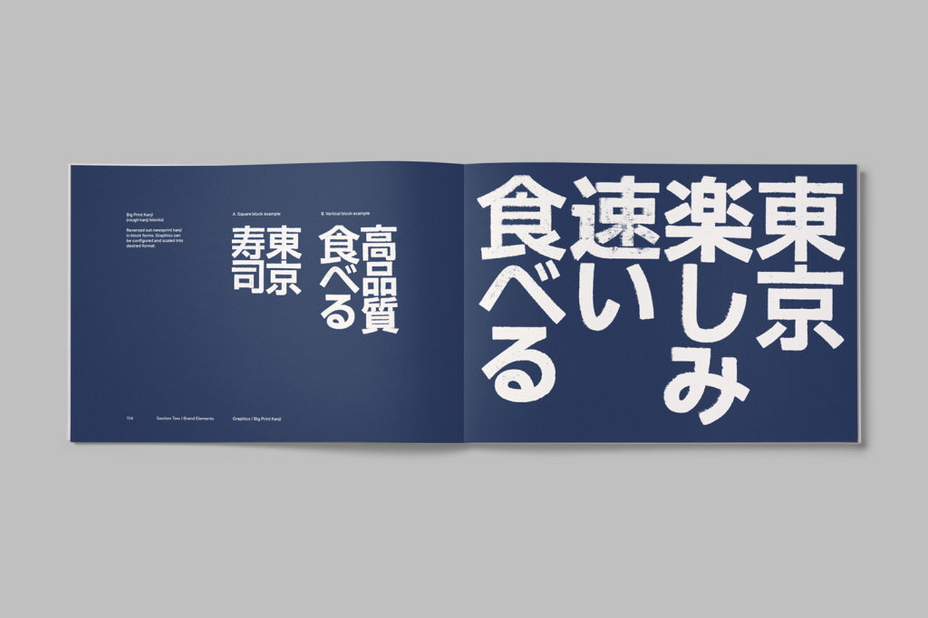
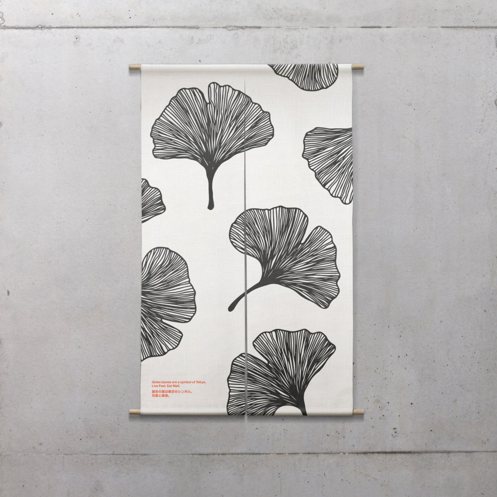
London-based graphic design studio Paul Belford Ltd. worked with UK restaurant chain YO! Sushi, now Yo!, to rebrand, as it expands into the US, the Middle East and further into Europe. This included an updated logo together with an extensive 200 page brand book, presented in a bespoke Japanese bento box, that covered a variety of new assets. The brand book covers menus, packaging, signage and illustrative noren curtains, as well as a guide to art direction.
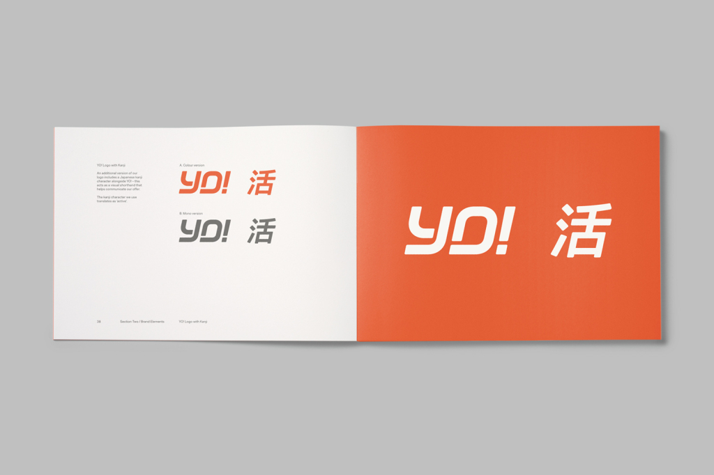
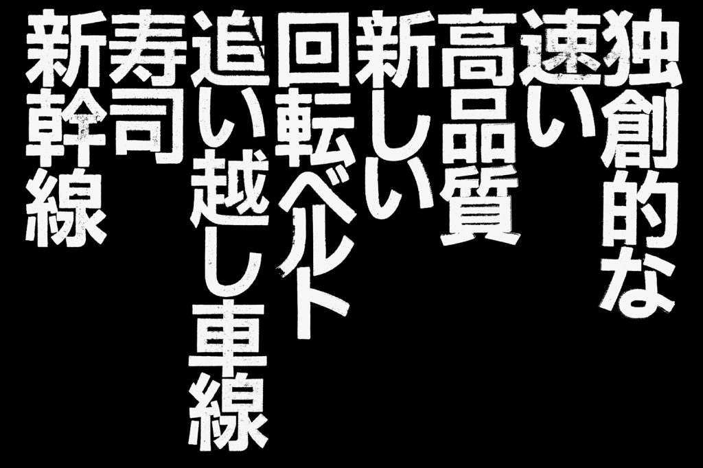
The logo feels far less anime and more urban in its influence. The breaks and monolinear letterforms move towards the neon signage, road networks and infrastructure of Tokyo’s frenetic cityscape, with some of the energy and equity retained from its previous iteration through italic characters and exclamation mark.
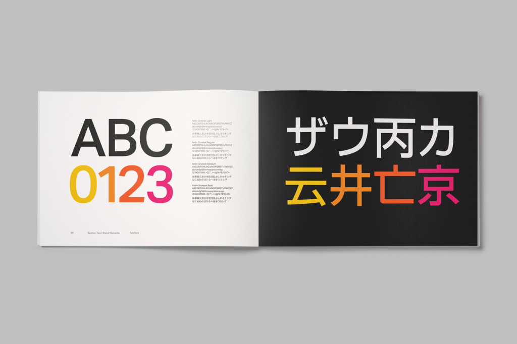
So, while perhaps a little less idiosyncratic, logo still leverages association, appears contemporary, honest and healthier in its restraint and expression, and establishes a stronger continuity between Latin characters and Kanji script. There is still personality and familiarity, but this works in conjunction, rather than in competition with, other more interesting assets, and comfortably sits alongside Aktiv Grotesk.


