Pretty pictures
Marian Bantjes’s first complete monograph, revealing the astonishing range of her graphic design, typography and illustration over the past decade. From a remote cabin off Canada’s Pacific coast, Marian Bantjes has created a unique visual language that combines typographical craftsmanship, illustrative flair and personal observation. Her generous approach, meticulous attention to detail and wit have made her one of the most sought-after graphic artists of her generation.
“This is it. This is the monograph of my work. It comprises almost everything I’ve done from 2003–2012. It took me a year to compile, design, write and produce (working once again with the wonderful Lucas Dietrich from Thames & Hudson). It contains somewhere around 800 images, including sketches and rejected concepts, with descriptions of each project and my thoughts (often painfully honest) on each.
CONTENT
While many monographs truly are just books of pictures, I wanted to create a book that answered many of the questions people ask me about my work, and showed both the process of some of the pieces and the progress and development of my career over the past 10 years. This book is full on intense. It’s not the type of thing you flip through and absorb at a sitting. In my usual manner, it is dense with imagery and information. The book may seem expensive but you get a complete wealth of information.
My intention was and is to never speak about this body of work publicly again. Everything I’ve ever had to say about the specific work is here: the details, the anecdotes, the stories. It is done.
I was also thrilled to have Rick Poynor agree to write a Foreword to the book, and in this he exceeded my expectations. I couldn’t ask for a nicer Foreword by a more eminent person.
STRUCTURE
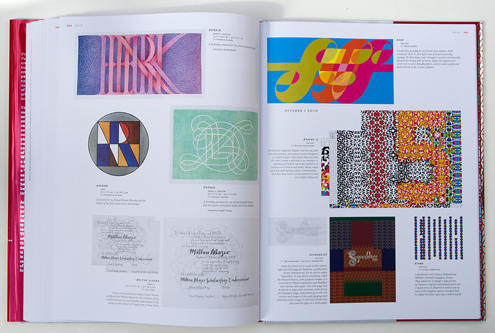
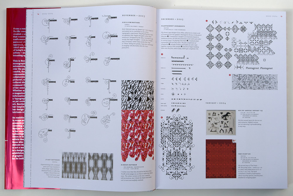
Pretty Pictures is arranged chronologically. It begins with a quick overview of my career as a book typesetter (1983–1993) and then as a graphic designer (1993–2003) with a splatter of thumbnails from my work through that time, and then jumps to the heart of the matter with the work I started on my own in 2003 in an attempt to make a living doing work that I love.
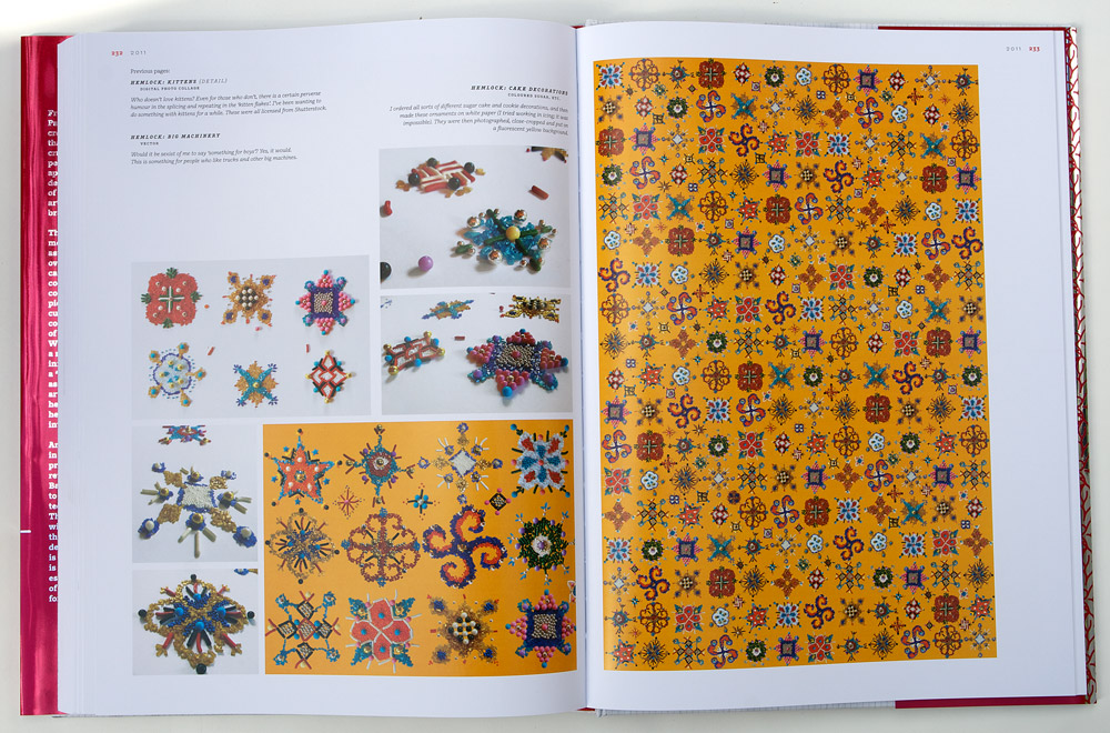
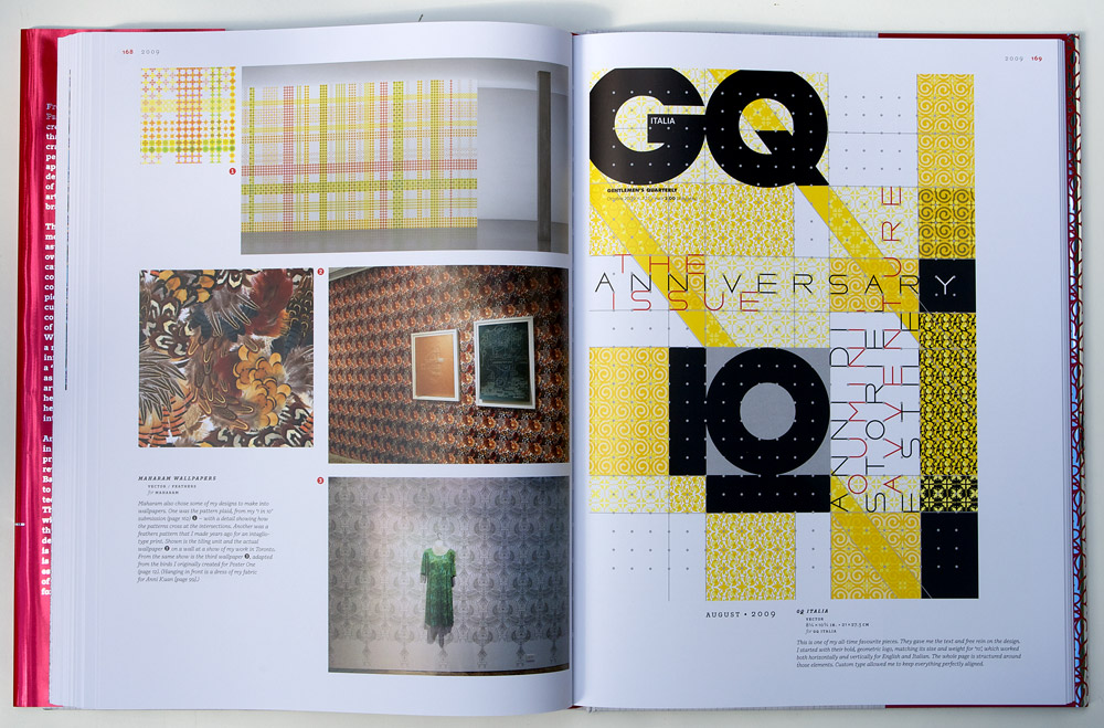
Each year begins with a synopsis of how I felt about that year’s work. Projects are listed by the month they were completed, with descriptions of the work, how the job went and my opinion of the final, with significant projects expanded to include sketches and other elements of the process where useful.
An index in the back lists projects by name, clients, groupings (“Posters”, Patterns” etc.), materials (“Pasta”, “Tin Foil” etc.), categories (e.g. “Rejected. See also Died, Killed”) and a list of Fonts used in projects. It also includes lists of other books and magazines my work is in, and conferences I have spoken at (up to September 2013).
DESIGN
While most art and design books are designed around a strict grid system, I needed more flexibity than this could afford. Because the book contains so many projects, some important and some minor, and because I already had a chronological structure I decided to allow myself to put the projects in any size that made sense and create structure out of each page spread. I allowed some fudging on the time scale (perhaps by a month) to accomodate interesting parallels between work and the visual balance of pages. This made things harder for myself than plopping things into grid spaces, but it makes a much more dynamic and interesting design overall.
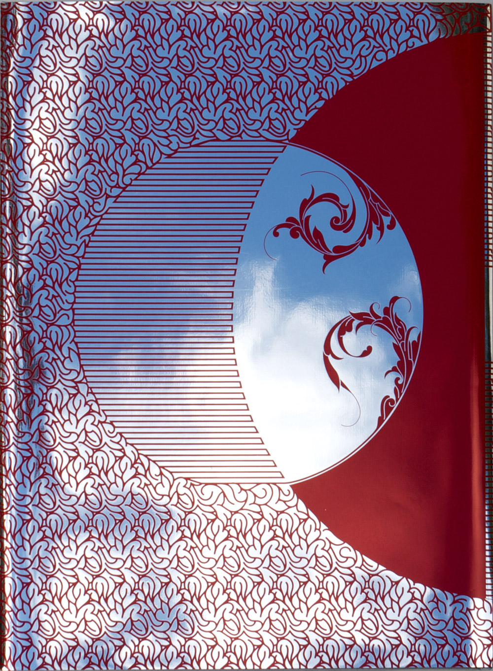
The book jacket is silkscreened in red on glorious mirror-reflective mylar, wrapped around a hardback cover, which reveals a surprise. “
Source; https://www.itsnicethat.com/articles/marian-bantjes-pretty-pictures