Lindblad Expeditions
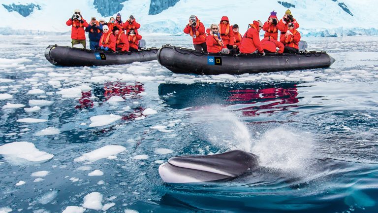
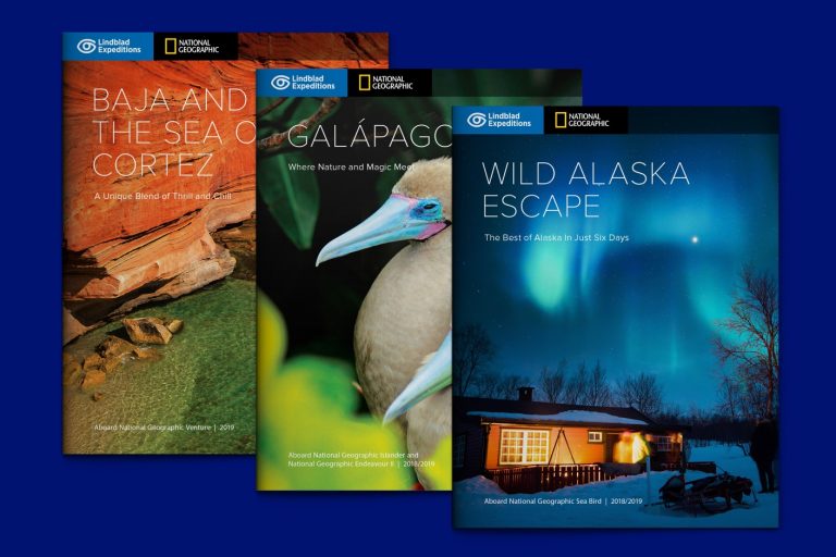
For over fifty years, Lindblad Expeditions has brought small groups of adventurous travelers to beautiful remote locations such as Antarctica, Papua New Guinea, and the Galapagos, among others.
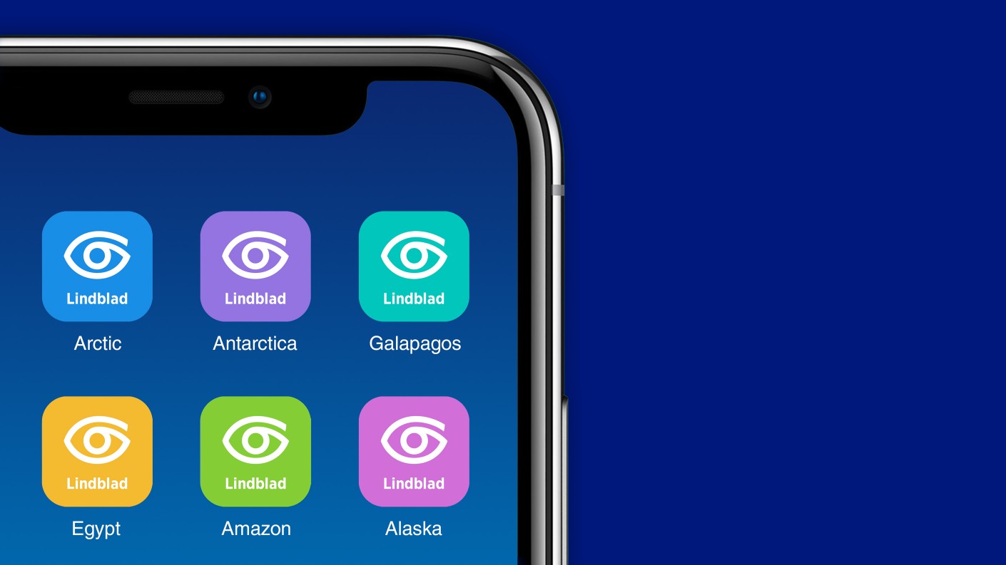
For most of this time, the company had been using as its logo a symbol of an eye that the founder had one evening quickly drawn on a bar napkin. While the eye is an appropriate symbol for a company focusing on the awe-inspiring sight of nature, the painterly rendition presented challenges in small applications, especially digital.
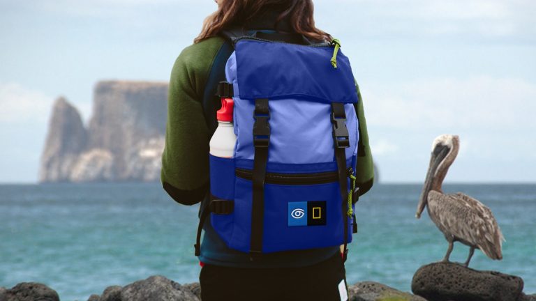
There were a number of technical challenges to this redesign. For one thing, in a crowded field of eye designs, it is difficult to create a distinctive eye icon that can clear legal hurdles while being simple enough to function everywhere. For another,as most of Lindblad’s expeditions are run in partnership with National Geographic,the Lindblad identity most often appears together with that of National Geographic(also designed by CGH).
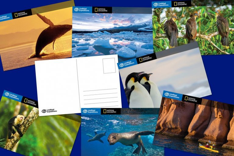
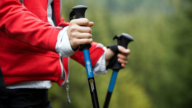
Our redesign retains the concept of an eye while reinventing its form as a modern icon. The new eye is formed from a single line—the journey each traveler undertakes.
The wordmark has been redrawn in a narrow, single-weight, modern sans-serif font to increase legibility in the restricted proportions of the Lindblad/National Geographic configuration.
The new identity brings the Lindblad eye and the National Geographic rectangle into a proportional and consistent relationship. The system facilitates flexible identification and is easily integrated into various formats and layouts.
source: https://www.cghnyc.com/work/project/lindblad-expeditions


