Introducing Gap
Gap is a well-known, well-established clothing and accessories retailer founded in 1969. It stands as one of the largest global specialty retailers due to its popularity amongst a broad demographic of consumers.
In 2010, following slumped sales after the Financial Crisis of 2008, Gap decided to redesign its 20-year longstanding logo, giving rise to the ‘Gapgate’ phenomenon. This article will look at the unfortunate backfiring of this logo redesign, highlighting the lessons that brands ought to learn from this seemingly unexplained rebranding strategy.


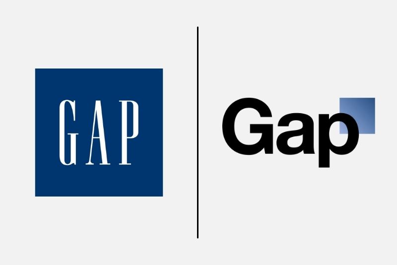
Gap’s highly recognizable logo, which represented the brand from 1990 to 2010, is a simple dark blue square featuring the ‘Gap’ name in white serif writing. Typically, a brand will undergo a visual rebranding following a significant change in the company’s strategy, which warrants a visual signal for something new within the organization. Therefore, the almost complete upheaval of the original logo in 2010 proved to be a shock felt (and expressed) amongst both consumer and professional communities.
The New Gap Logo
The old Gap logo disappeared pretty much overnight. It was replaced on October 6, 2010, with a new logo that featured a much smaller dark blue box and the ‘Gap’ name written in bold, black Helvetica font. This new logo was designed by a leading New York based creative agency, Laird and Partners, who holds a solid reputation in the field of branding and communication in the fashion industry. It is estimated to have cost around $100 million. (1)
Gap’s vice president of corporate communications, Bill Chandler, when asked about the change, said, “We believe this is a more contemporary, modern expression. The only nod to the past is that there’s still a blue box, but it looks forward”(2). A spokesperson for Gap added that the new logo was intended to signify Gap’s transition from “classic, American design” to “modern and cool.” (3)
Gap seems to have embarked on a mission to modernize and rejuvenate the company, along with its sales figures and stock prices. This urge to modernize has been criticized as a “panic to do something, and quick”, to fix fallen sales (Baekdal, 2010), with figures showing that same-store sales at the time were down 4%, following a 10% decline the year before (4)
In an embarrassingly quick turnaround, Gap took the decision to revert back to its old 1990 logo after less than one week (on October 12, 2010). The same spokesperson, now backtracking on her original “modern and cool” comment, stated that “we’ve learned just how much energy there is around our brand, and after much thought, we’ve decided to go back to our iconic blue box logo” (5).
A Logo Redesign Failure
Gap’s speedy return to the old logo signifies a failed rebranding strategy. The new logo received almost immediate negative backlash from both consumers and professionals, who were taken aback by the change, which occurred without any prior build-up. The move neither seemed to accompany any other organizational change, for example, in product offering or senior management.
So why did consumers feel so strongly about the new Gap logo?
Brand Recognition
Consumers use logos as a key signifier of a brand; it’s often the first thing that comes to mind when a person thinks of or hears a brand name. The logo, therefore, largely contributes to building brand salience. Changing your logo at the drop of a hat causes confusion and risks depleting any brand awareness that has been built. Will customers know that you’re the same brand they’ve always known and loved?
Emotional Connections
Brands often underestimate their emotional impact on consumers, particularly their loyal ones. This emotional bond exists because a brand and its reputation (complete with its recognizable name and logo) have the power to offer a consumer a sense of familiarity and safety about the products they purchase.
Put simply, the logo is a visual indicator of trustworthiness and acts almost as a connection point between the brand and the consumer – consumers know what they are getting behind the logo. The same logic applies between humans – familiar and recognizable faces provide us with a greater sense of safety and trust.

What Can Brands Learn from Gap’s Mistakes?
This case study has revealed that a company’s logo plays a central role in connecting consumers with brands, and therefore in enhancing brand equity.
Conclusion
It is difficult to predict how people will react to a new branding strategy. This case study illustrates the power of a logo to define who you are and to act as a connection point between you and your customers. Making drastic changes to this connection point must be done in line with a wider branding and business strategy. Otherwise, brands risk facing the wrath of consumers whose opinions easily serve to damage their reputation.
Source: https://www.thebrandingjournal.com/2021/04/learnings-gap-logo-redesign-fail/


