Bechtel Corporation
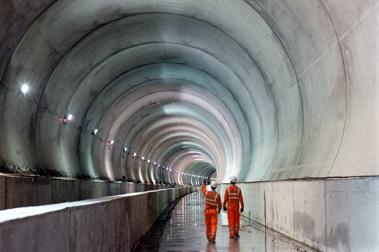
The largest construction and engineering company in the United States, Bechtel Corporationis one of the most influential privately held, family-run businesses in the world. The companybegan operations in 1898, building railroads in the American West,and over the years gainedan impressive reputation for tackling large and difficult problems around the world: theHoover Dam, the Trans-Arabian Pipeline, the Three Mile Island cleanup, the Chunnel,multiple Olympics facilities projects, the Sydney Metro,the Tacoma Narrows Bridge, theRiyadh Metro, and many more.
As the company prepared to celebrate its 125th anniversary, the fifth-generation chairman, Brendan Bechtel, undertook a reorientation of the company’s vision and values. As part of this repositioning, the company was ready to consider updating its visual identity.
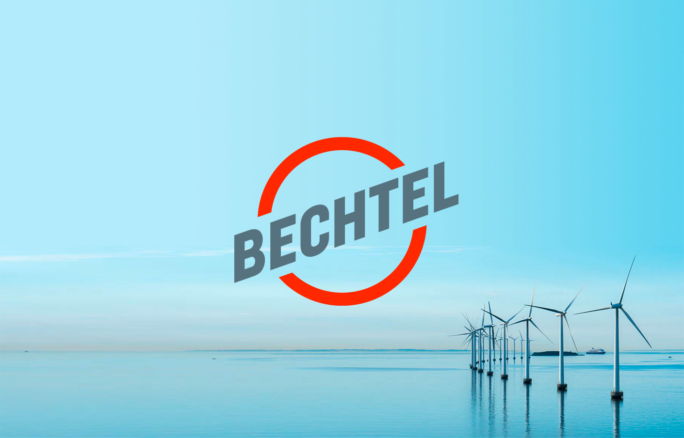
The Bechtel “bug” was first designed in the 1940s and had changed slightly since then. Although the mark served the company well for many decades, representing tradition and camaraderie, it didn’t perform well in digital applications and it was time for a sharper, modern, and more dynamic logo that reflects who the company is today while honoring its legacy.
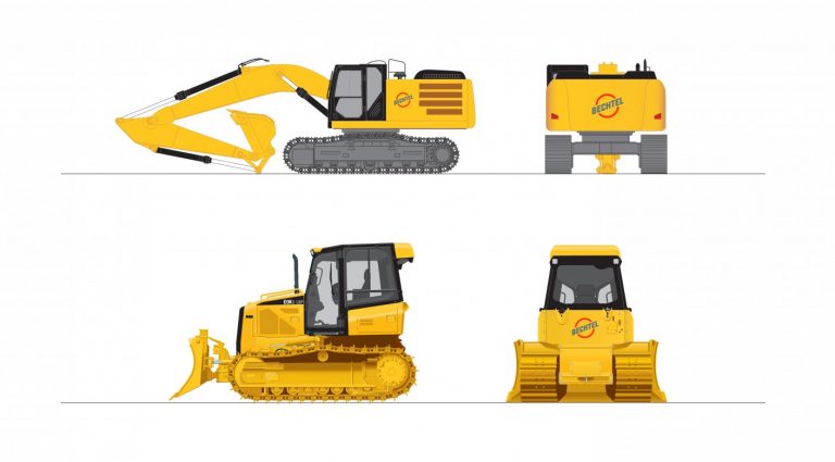
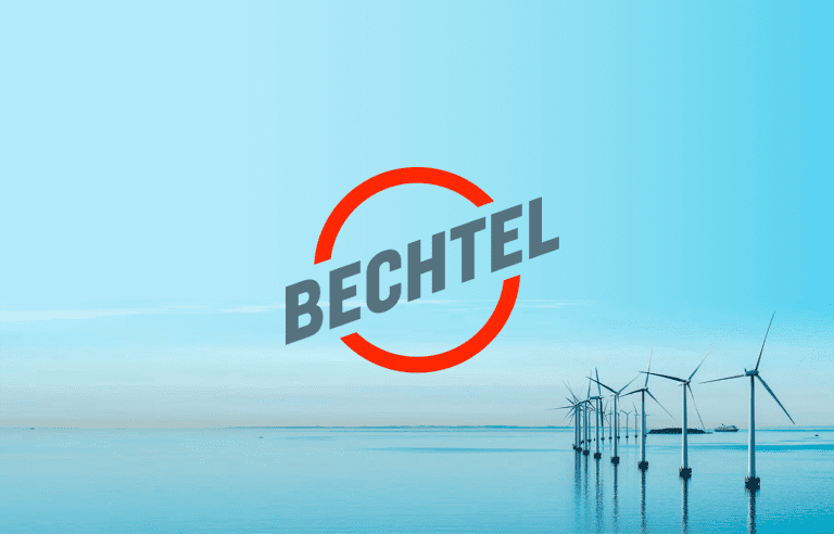
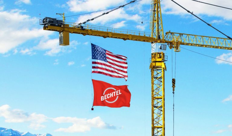
The new logo is an evolution of the Bechtel visual heritage, maintaining the shape and footprint of the original mark created in 1947. It puts the emphasis squarely on a modernized rendition of the well-known Bechtel name. The circle silhouette is no longer a representation of the globe, but instead an open form, designed to bewelcoming, timeless, and strong, reflecting the company values of focus,completeness, and inclusivity. Distinct to the new logo is its ability to pull in the environment, reinforcing Bechtel’s approach of partnering with customers and communities.
Source: https://www.cghnyc.com/work/project/bechtel


