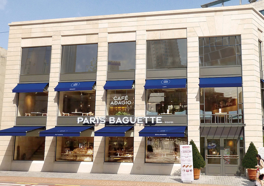
Paris Baguette
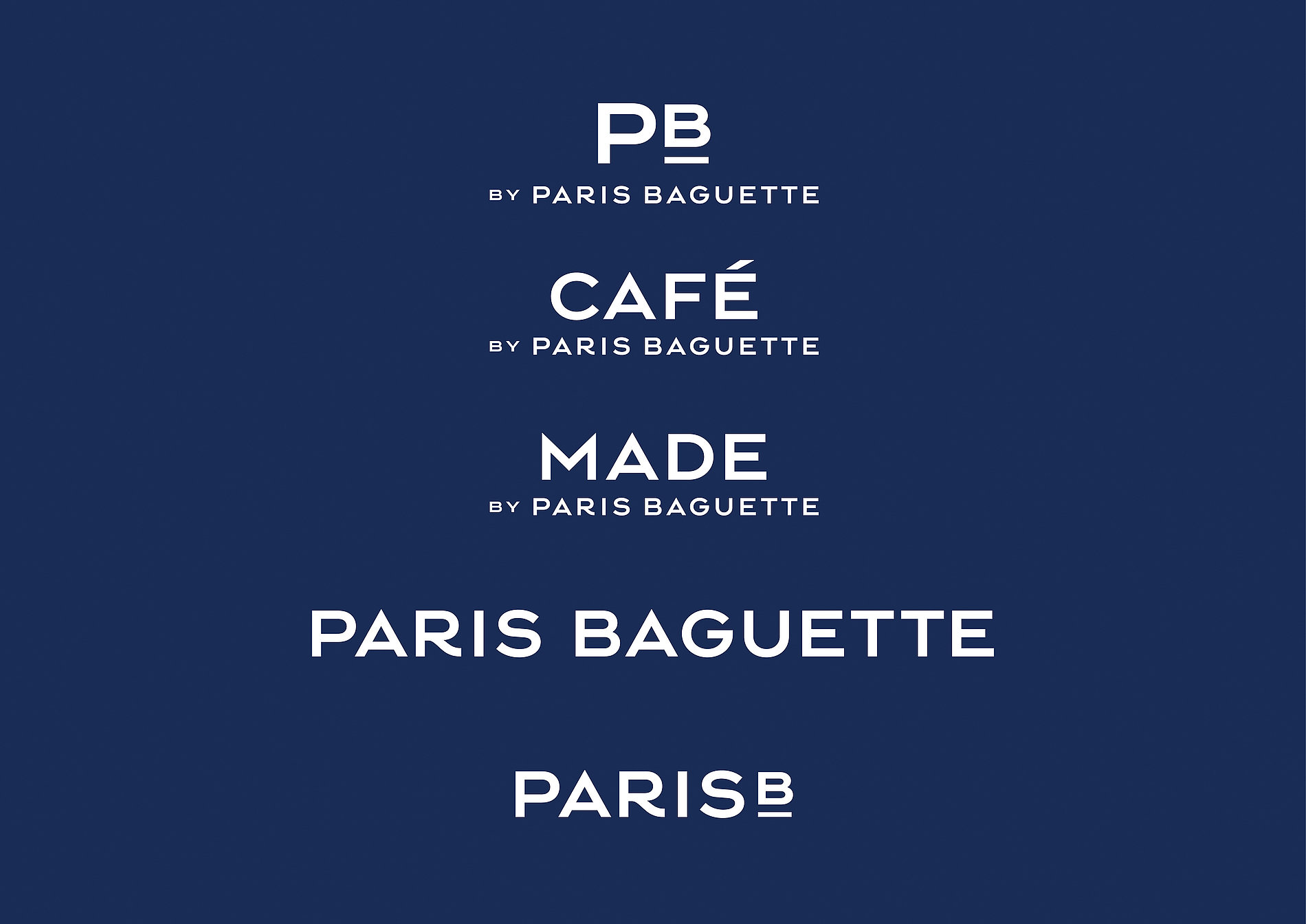
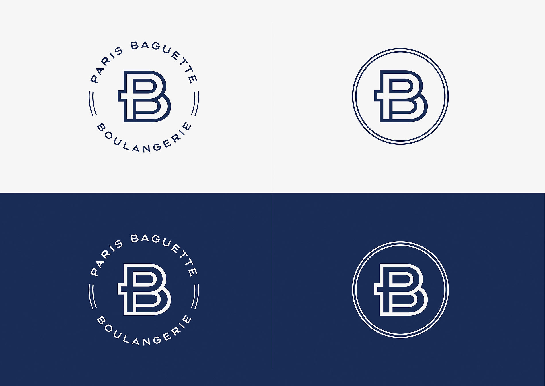
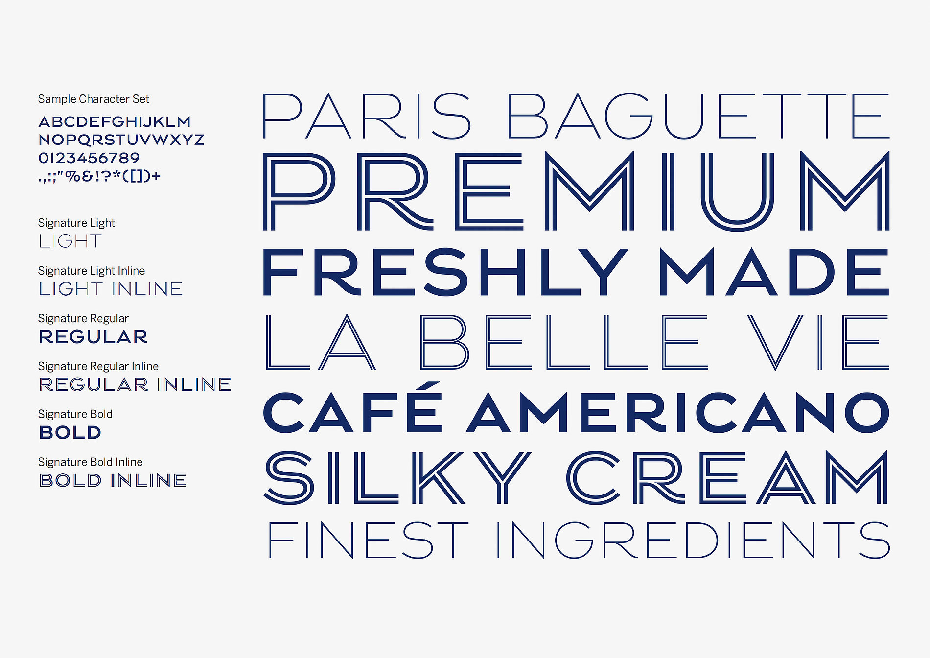
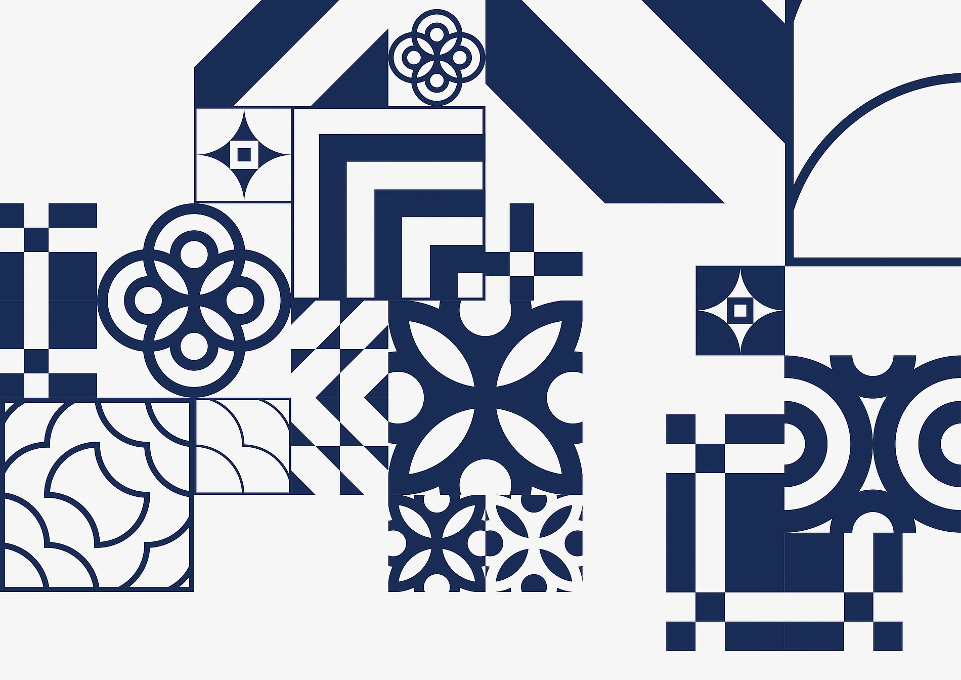
Balanced with the graphic art deco traditions of early 20th-century French design, the visual identity for Paris Baguette shows a clean and minimal modern style. Named “La Belle Vie” (The Good Life), the identity aims to be essentially modern European, while also retaining a sense of Paris and France. Visual elements like evolved logotypes, marques and the company’s brand colour of blue mean to add sophistication. A bolder personality is intended by mixing French inspiration with a modern design sensibility, such as a new Paris Baguette house typeface and the range and application of new patterns.
Paris Baguette, South Korean conglomerate SPC’s biggest FMCG franchise brand, had reached maturity in its home market and was expanding rapidly internationally. Brody Associates was commissioned to develop a new brand identity, bespoke typeface, PB Signature, and creatively direct the new cross-platform visual language.


Client: SPC
Project: Paris Baguette Brand Identity
Specialism: brand identity, typography, and creative direction
Credits: Paris Croissant Co., Ltd.
Source: https://brody-associates.com/