Neville Brody Coke
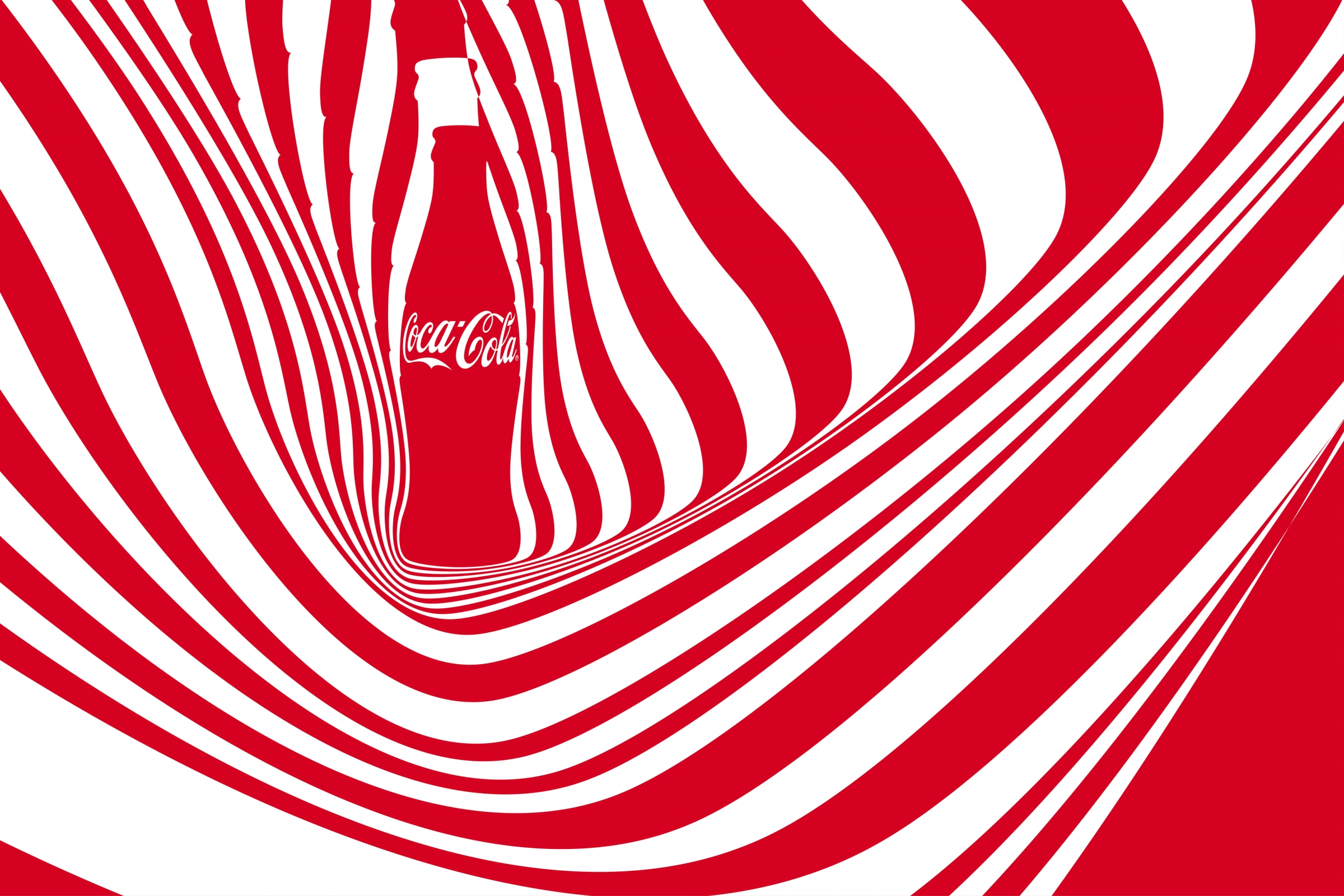
Coca-Cola has revealed its new typeface designed by British graphic designer Neville Brody, marking the first time that the brand has had its own unique font in its 130-year history.
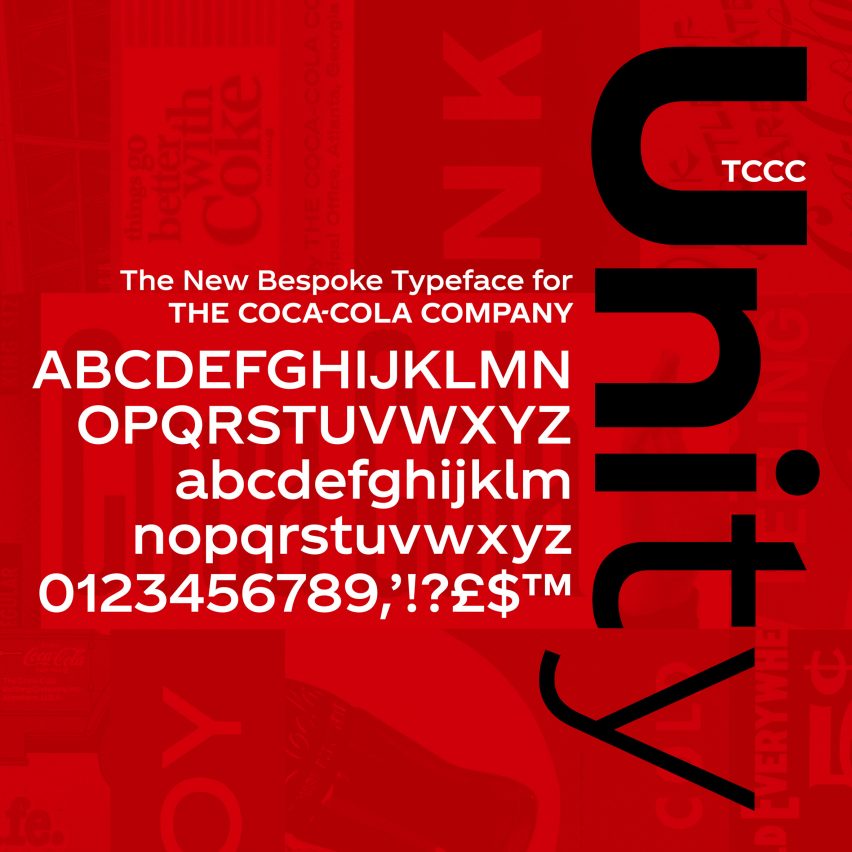
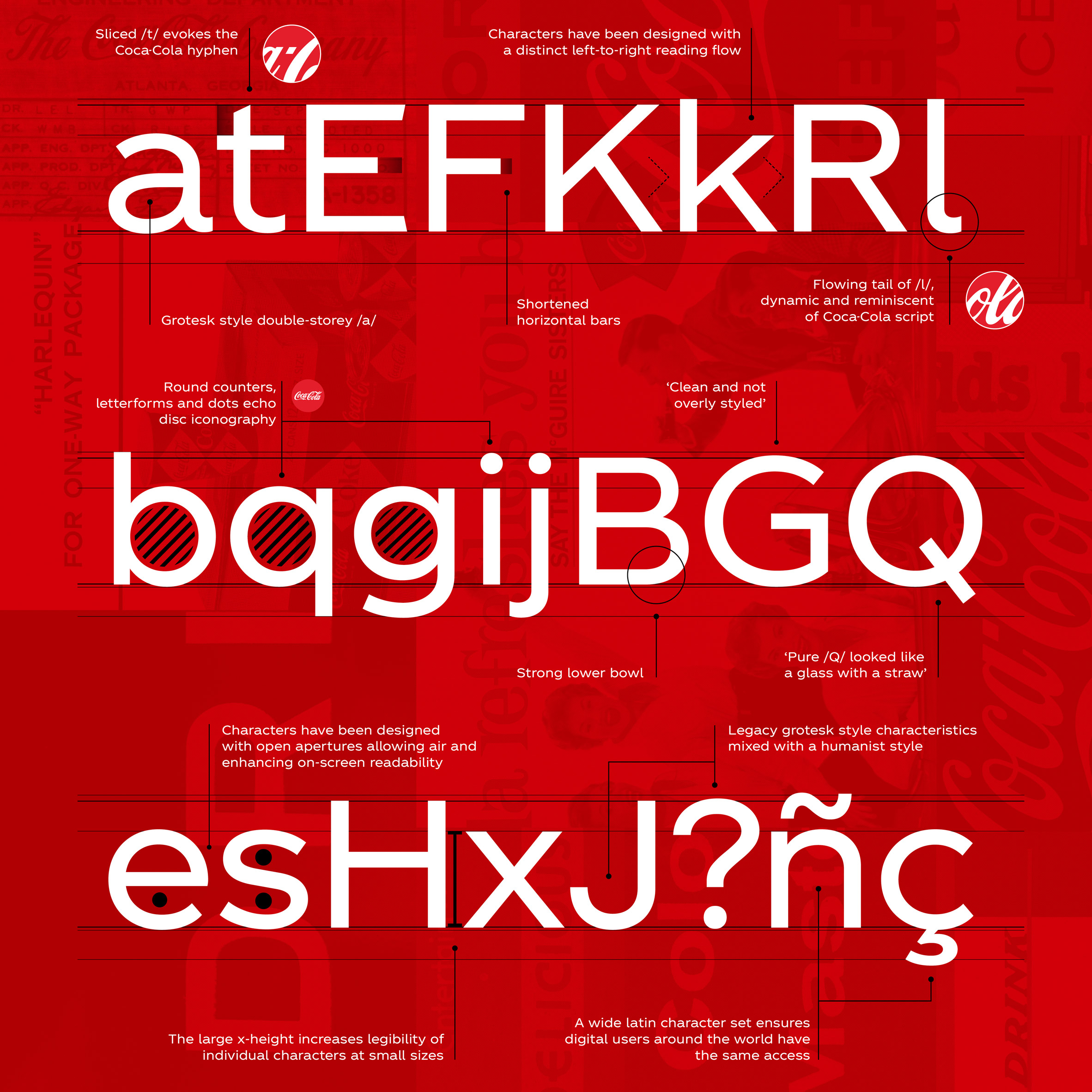
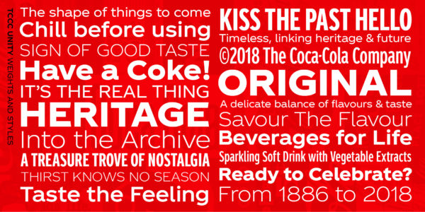
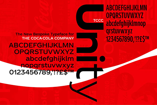
Named TCCC Unity – an acronym of The Coca-Cola Company – the typeface was unveiled last week at the Museum of Design Atlanta by Coca-Cola’s vice president of global design, James Sommerville, who told the audience that the typeface “encapsulates elements from Coca-Cola’s past and its American Modernist heritage.”
The font, designed by Neville Brody’s eponymous typographic design agency Brody Associates, is the first own-brand typeface in the soda company’s 130-year history.
Brody, known for his pioneering work in the late 80s and 90s as the designer behind influential magazine The Face, was asked to create a flexible typeface for Coca-Cola that would work across all scales and platforms.
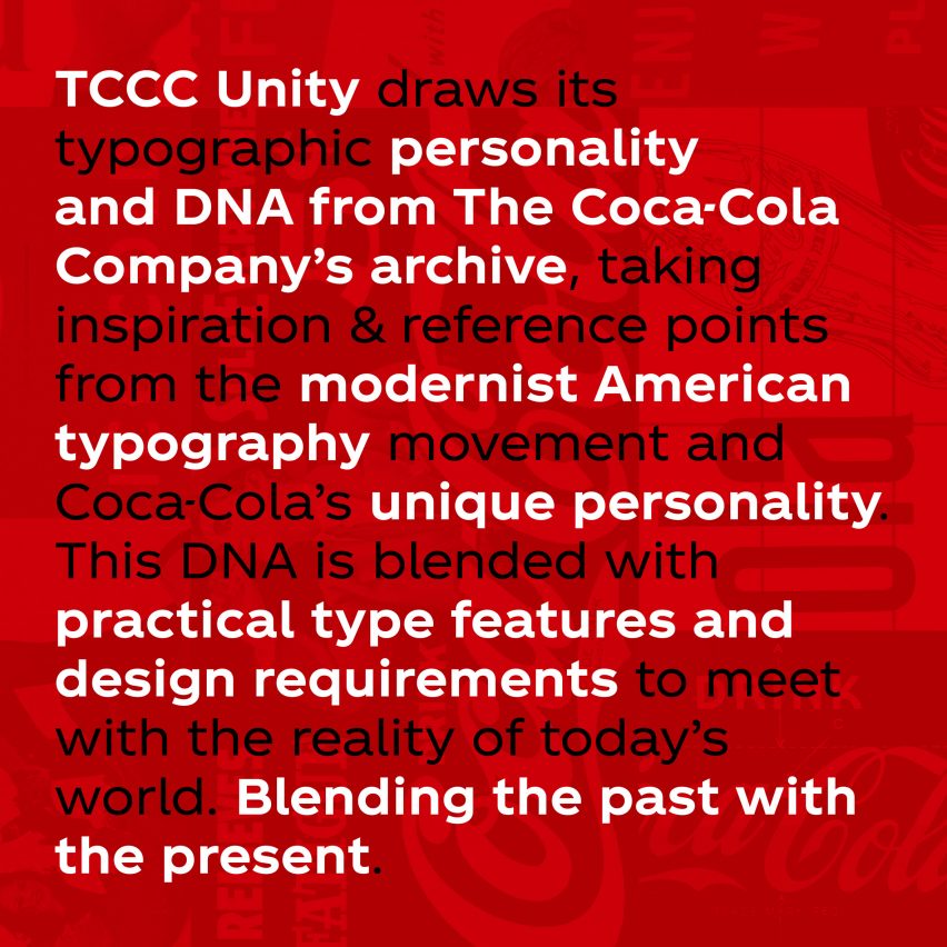
Using the brand’s extensive archive for inspiration, Brody worked with alongside the in-house team at Coca-Cola to develop a typeface that retained a level of familiarity.
While Coca-Cola described the resulting TCCC Unity as a future-facing font, others were quick to point out that a new typeface will not be enough to rectify declining soda sales.
In an article for Fast Company magazine, writer Mark Wilson called the typeface a “modern font for stone-aged thinking”, stating that “Coca-Cola continues to operate under the mindset that its sinking soda ship is a brand problem rather than a product problem.”
He added: “…it’s time that Coca-Cola rethinks its core convictions, and what it can do with a global distribution network other than sell more soda.