Paula Scher – The Public Theatre
Work
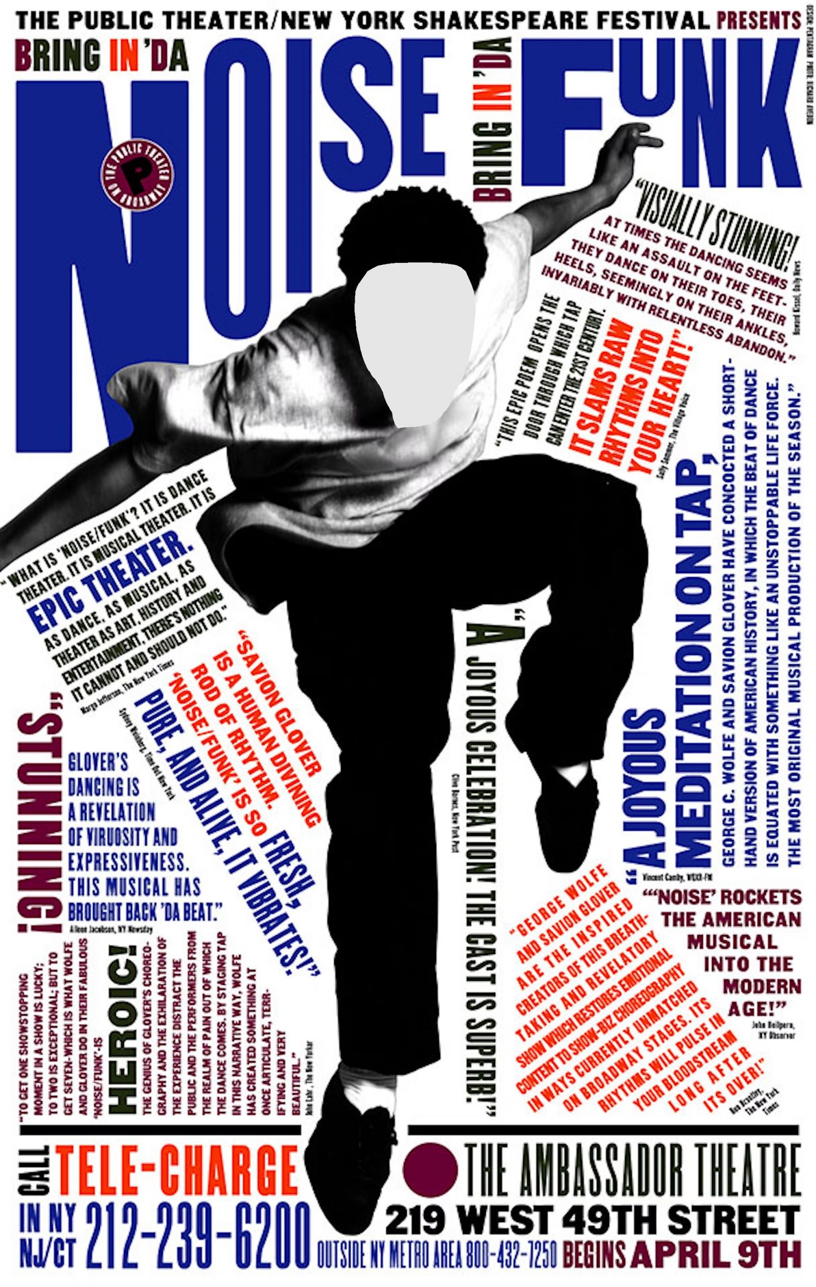
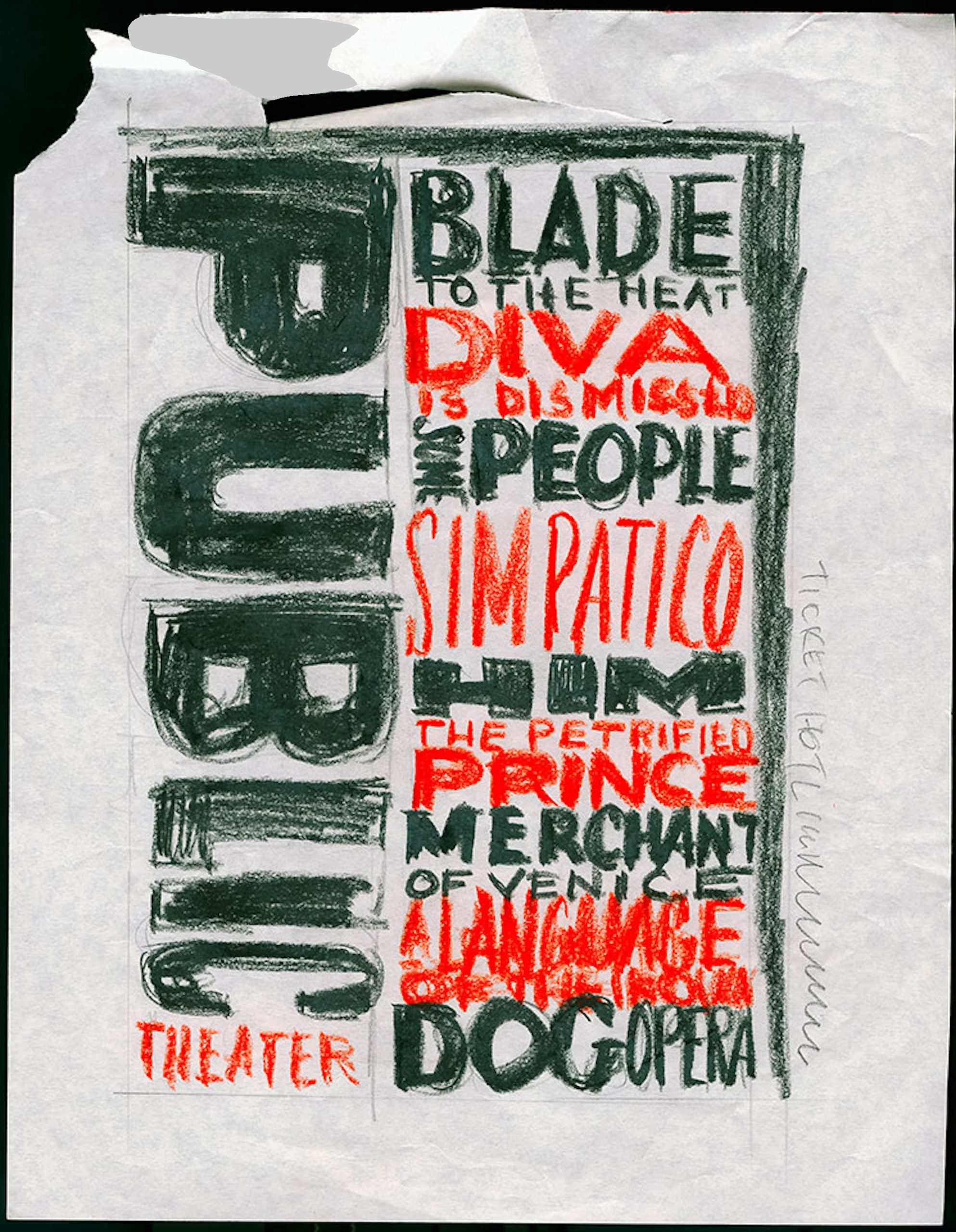
Since 1994, Pentagram has been involved with the graphic identity of the Public Theater, a program that would eventually influence much of the graphic design created for theatrical promotion and for cultural institutions in general. The original identity responded to The Public’s mission to provide accessible and innovative performances, creating a graphic language that reflects street typography in its extremely active, unconventional and almost graffiti-like juxtaposition.
After this campaign, The Public’s typographic style popped up everywhere, from magazine layouts to advertising for other shows. In fact, the whole style of theater advertising changed and everything began to be displayed in blocky wood type in all caps. The Public’s campaigns have had to continuously change to stay fresh in the city’s highly competitive theatrical market.
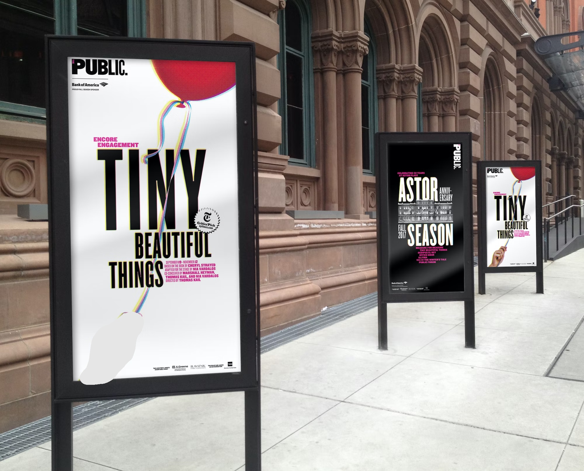
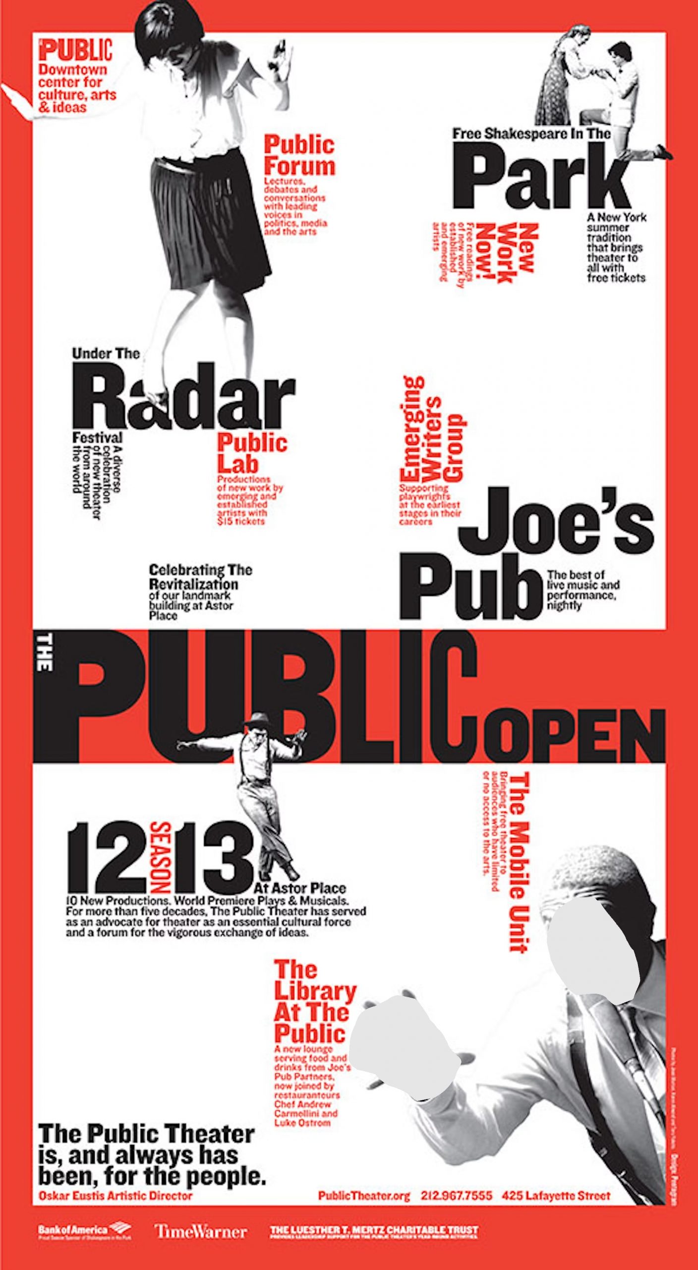
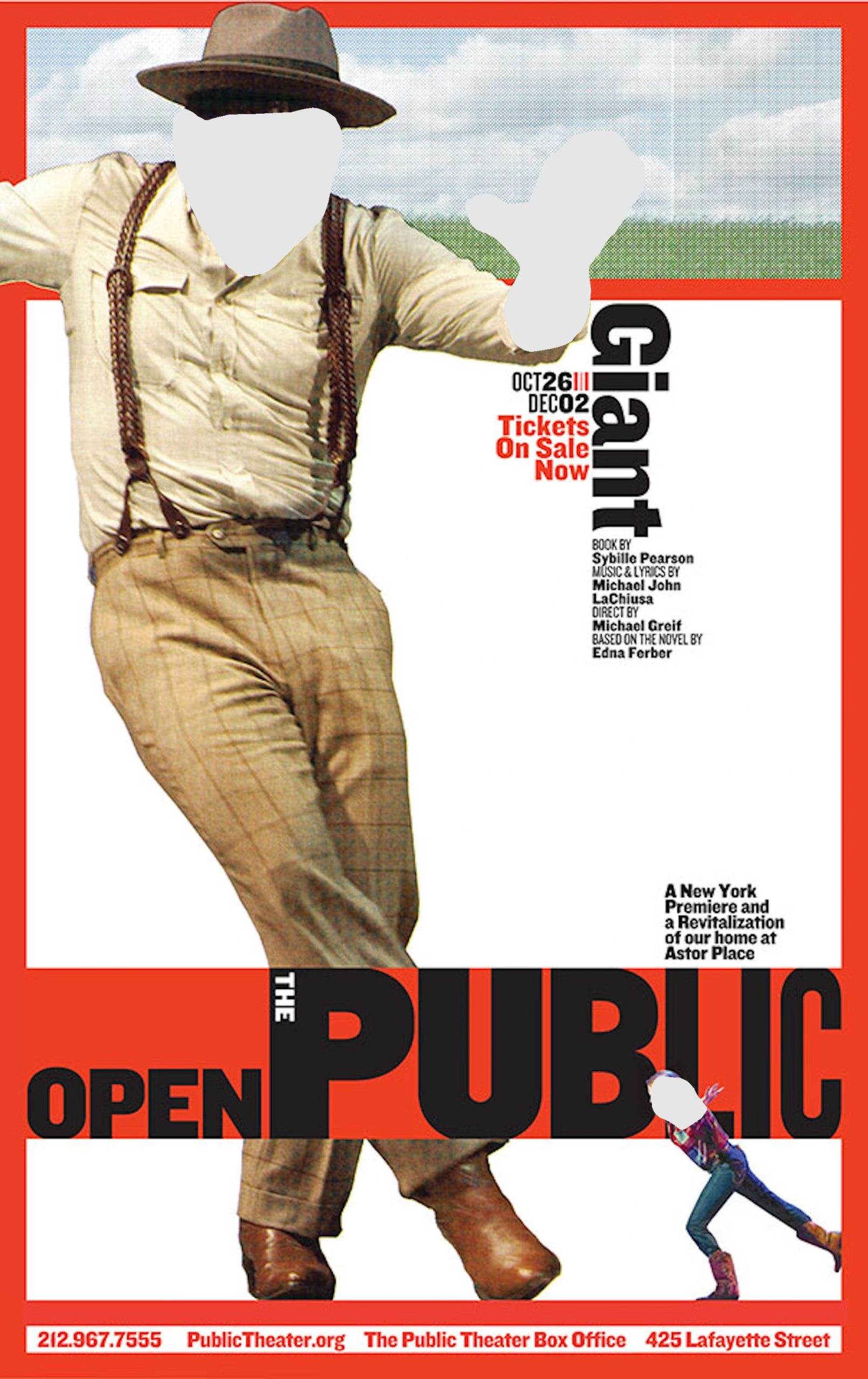
In 2008, Pentagram updated the identity, produced in conjunction with a major renovation of The Public’s multi-theater complex on Lafayette Street. The letterforms have been redrawn using the Hoefler & Frere-Jones font Knockout. The new system is more refined as it retains the active nature of the original but provides more structure, while the change from a vertical to horizontal organization has the effect of making the logo more architectural.
This new graphic system was first seen in the 2008 Shakespeare in the Park posters that utilize the strict 90° angles of a De Stijl-inspired grid. Retained is the bold Victorian wood block type but now, the space is organized by angled printers rules, a distinctive throwback that adds structure while it references wood block type.
Pentagram also designed the exterior scaffolding signage for the upcoming renovation by Polshek Partnership Architects as well as the environmental graphics for the new facilities.
Source: http://www.pentagram.com/


