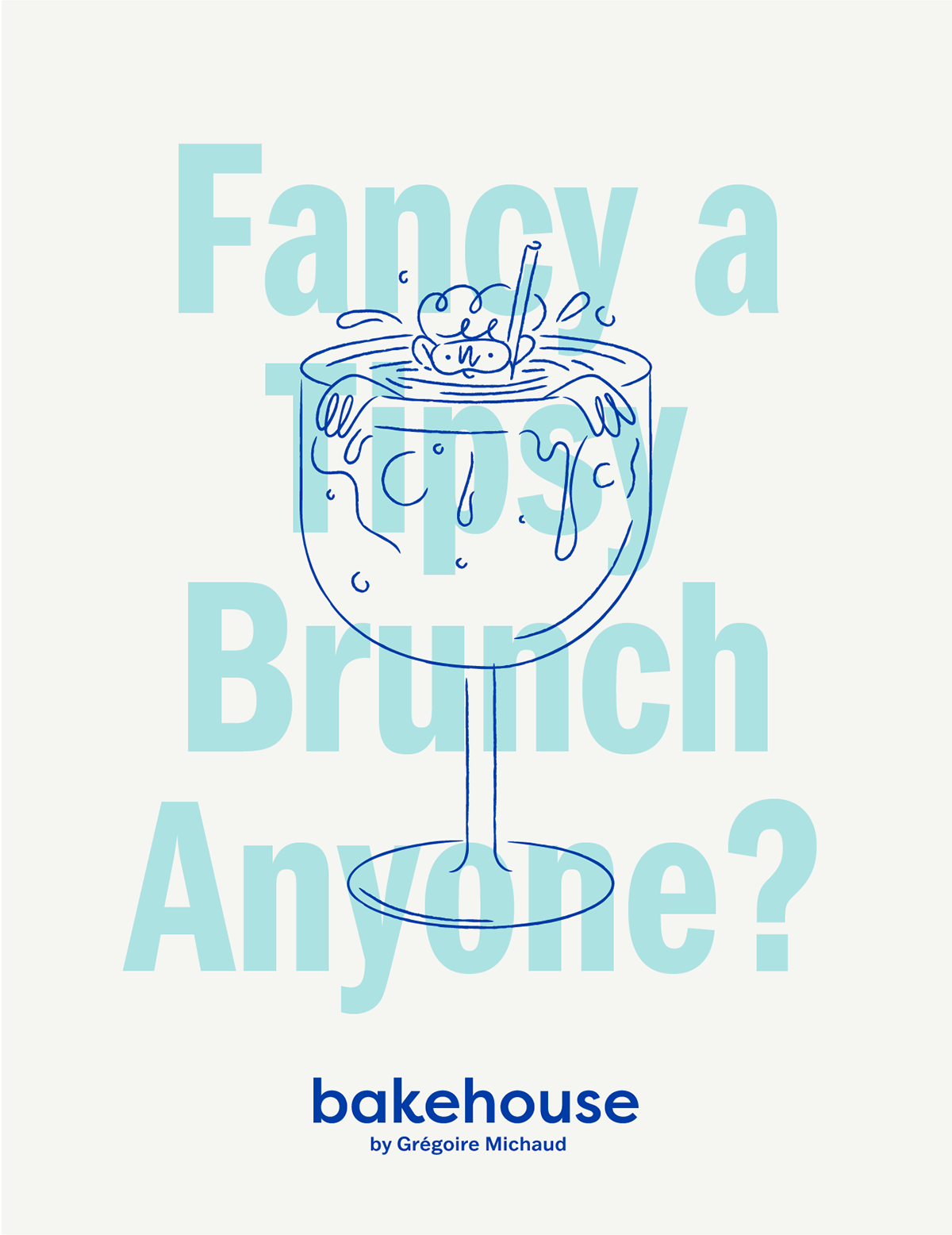
Bakehouse Hong Kong
I was fortunate enough to have worked under the creative direction of one of Hong Kong’s elite design studios, Kith&Kin. I was hired to help produce a rebrand for bakehouse, a local and legendary bakery that has soared to great heights since its opening by Grégoire Michaud, in Hong Kong just a few years ago.
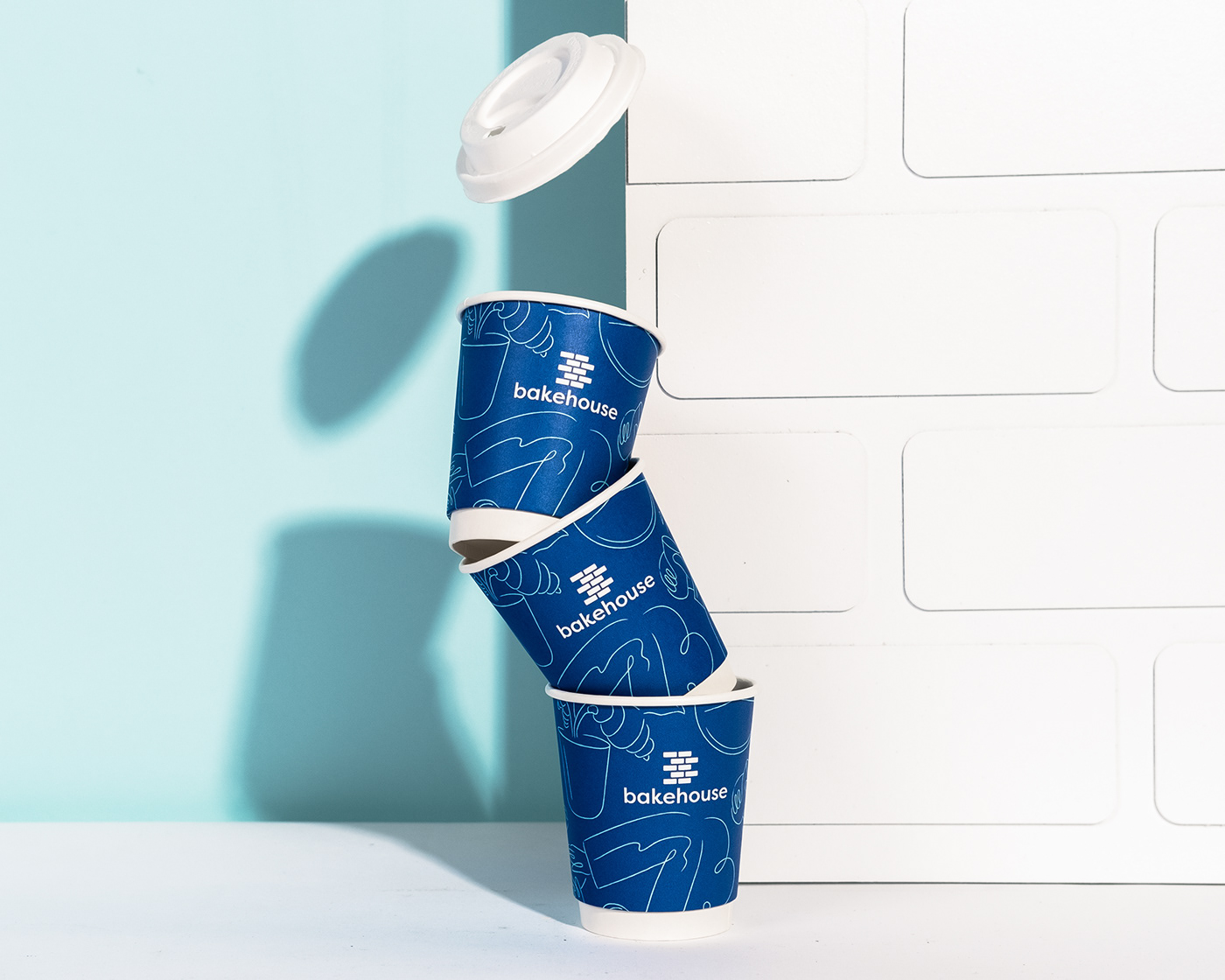
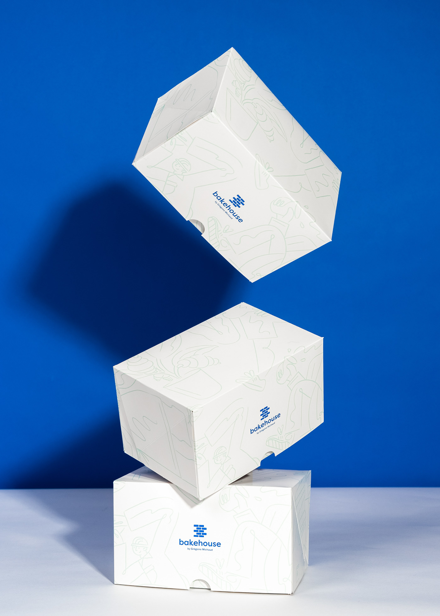
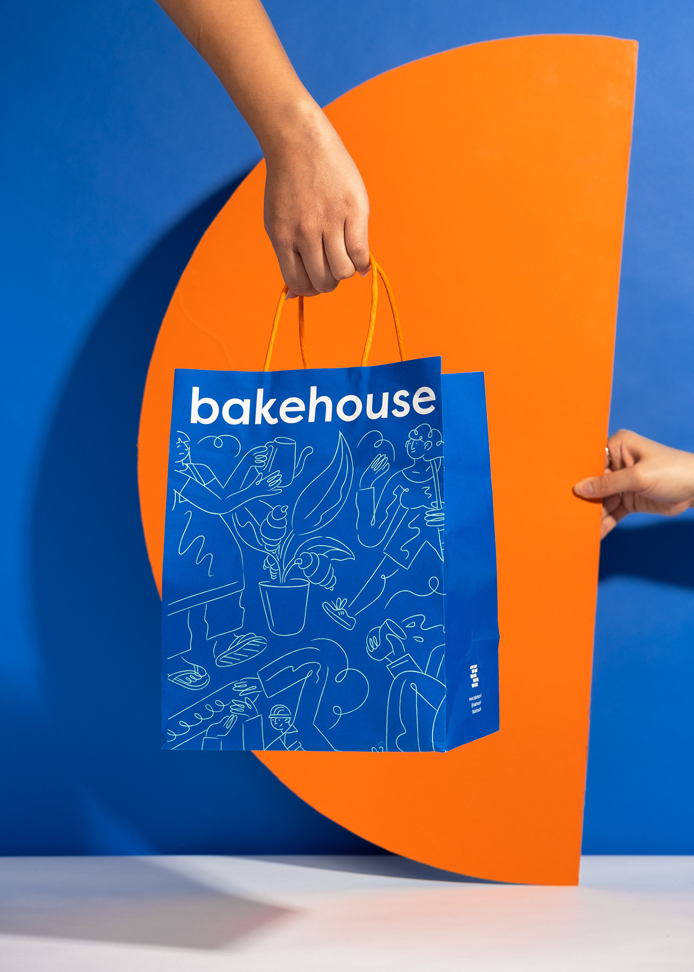
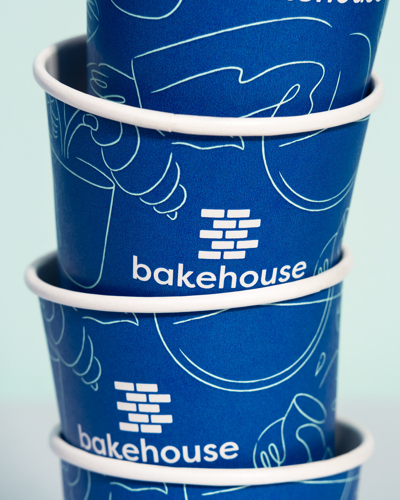
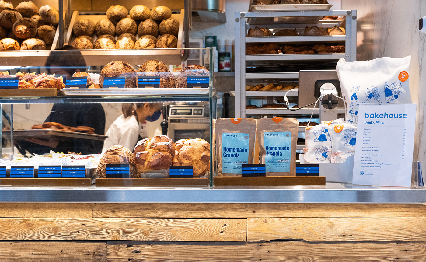
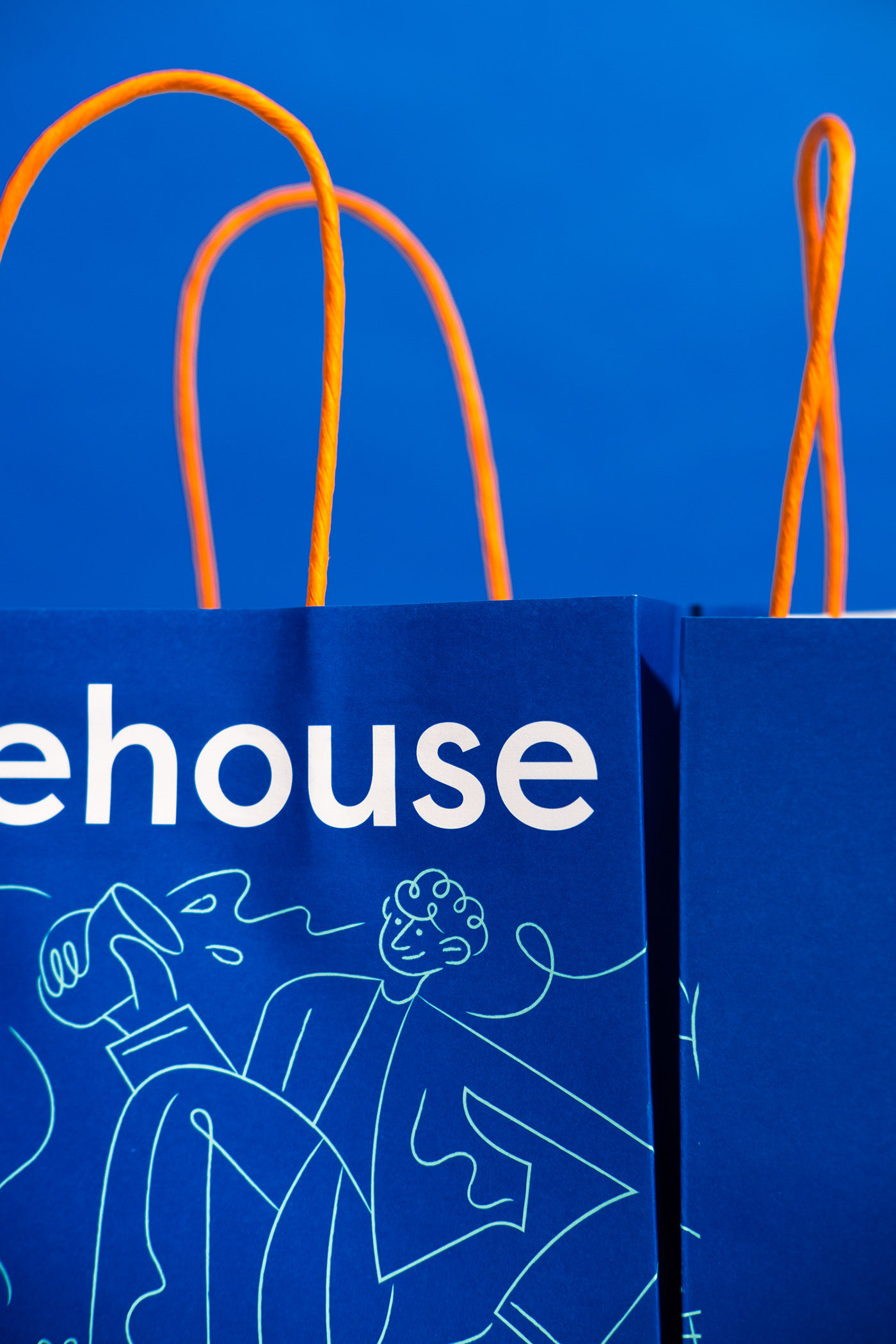
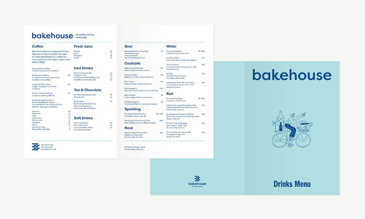
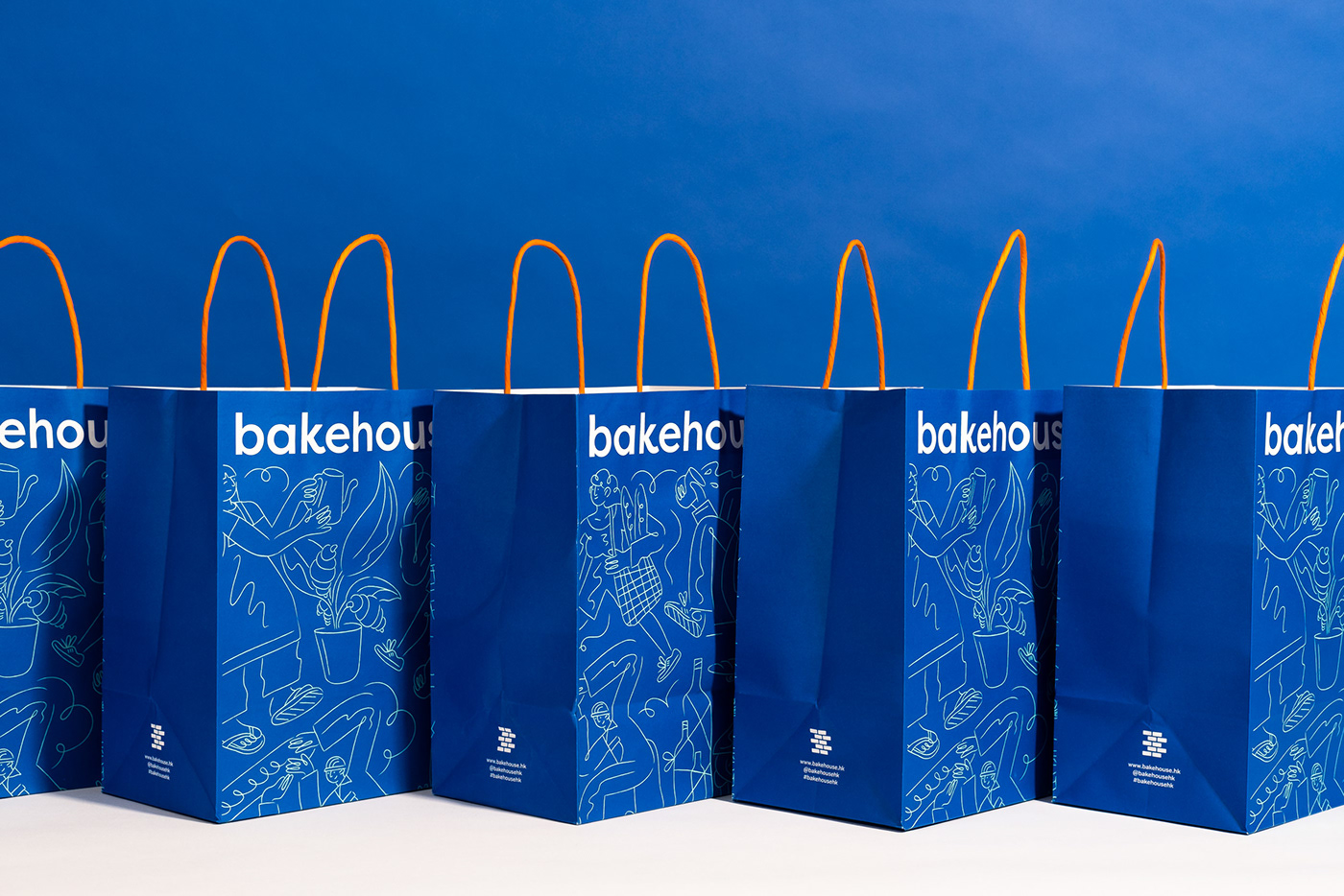
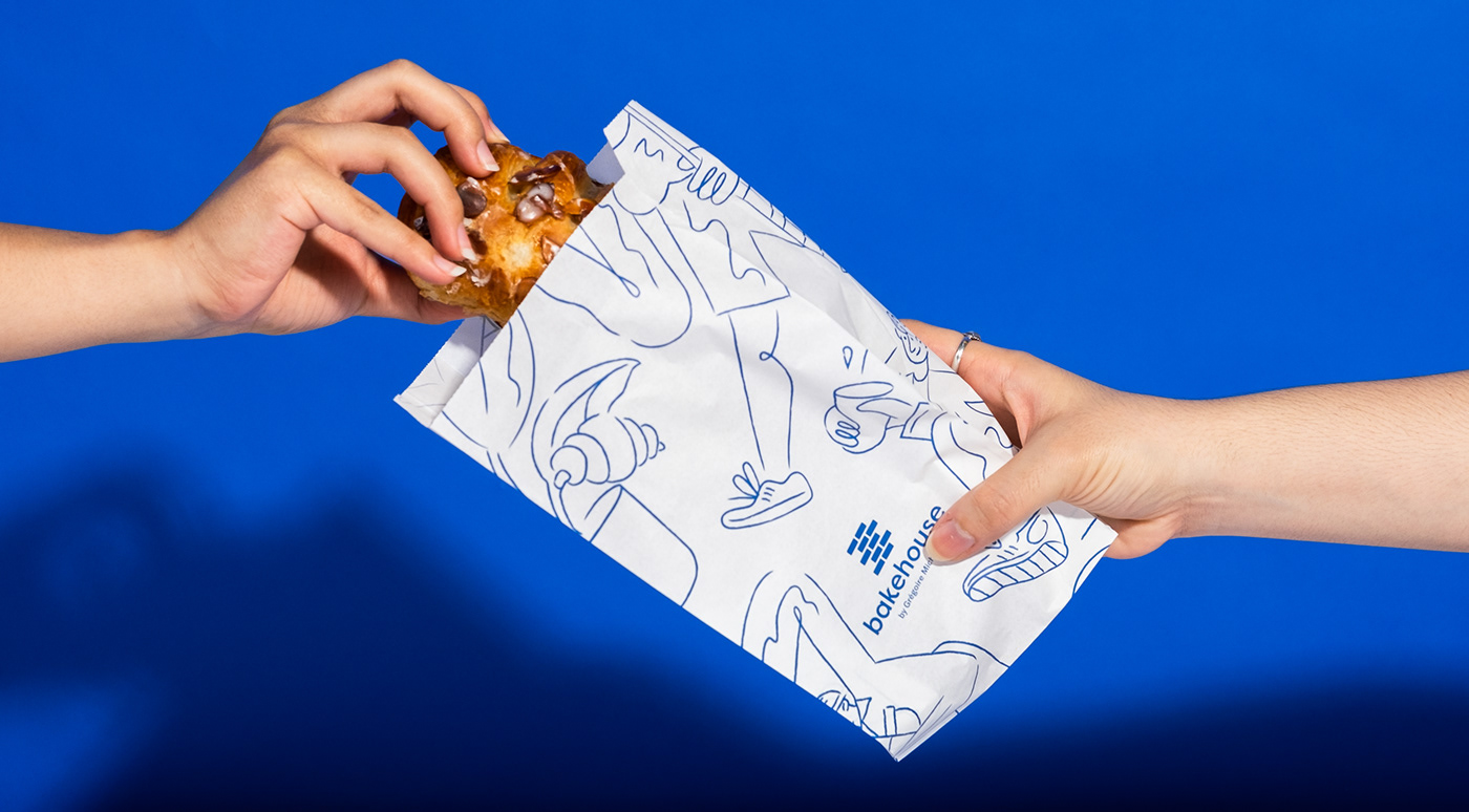
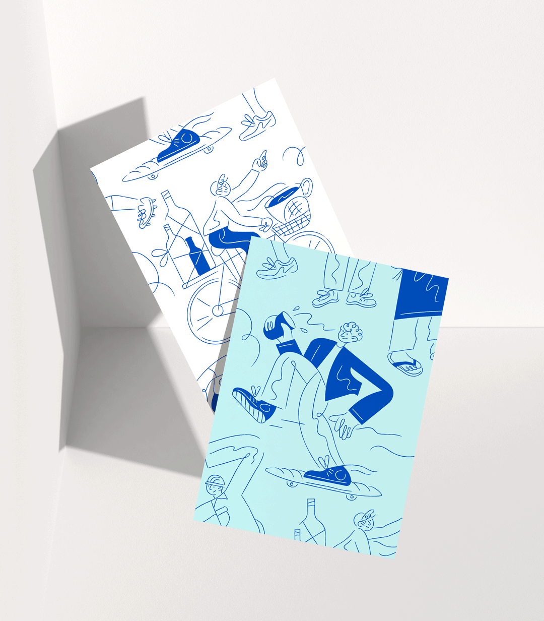
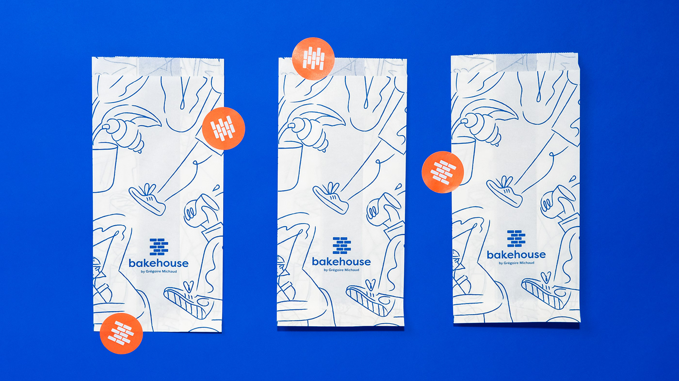
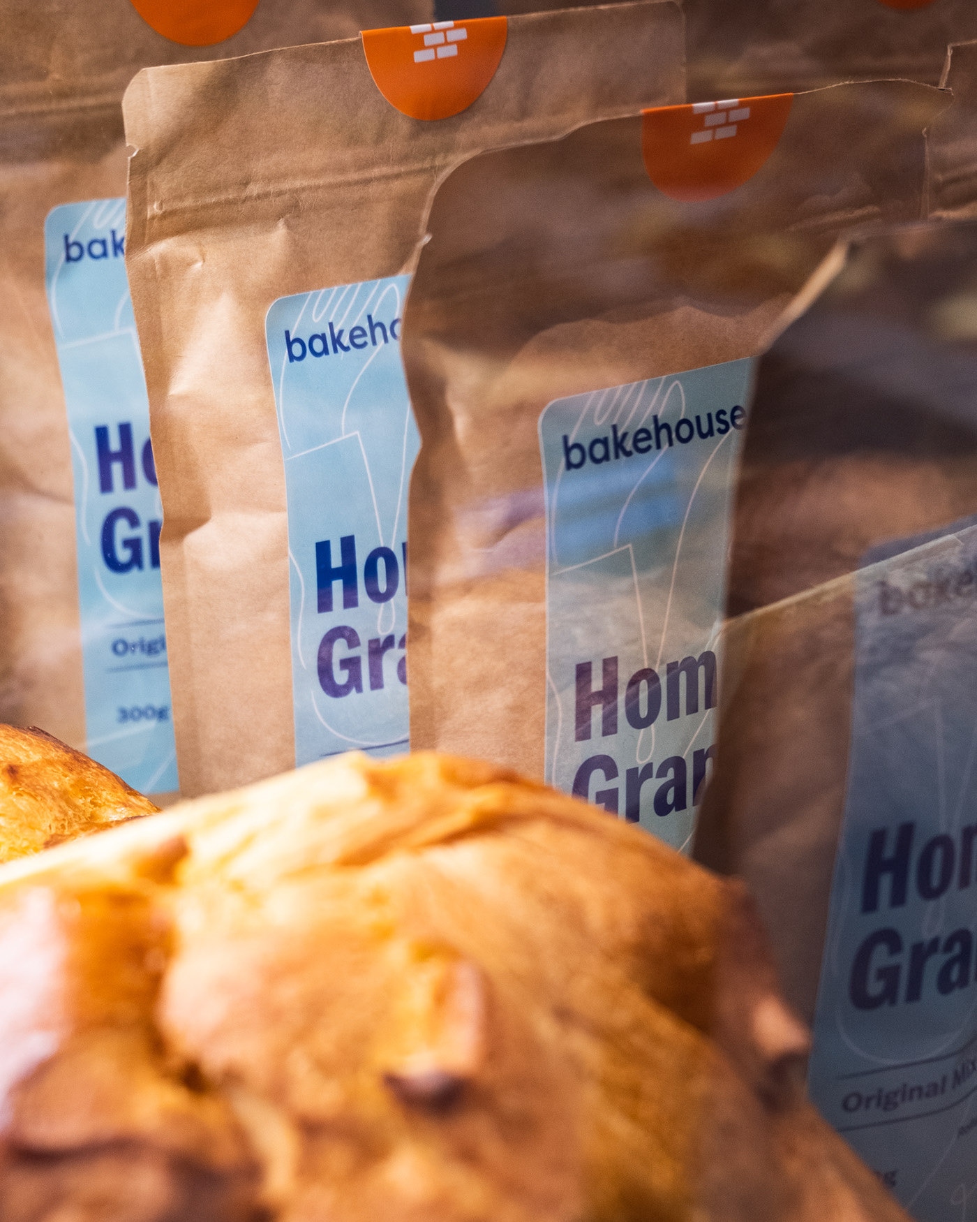
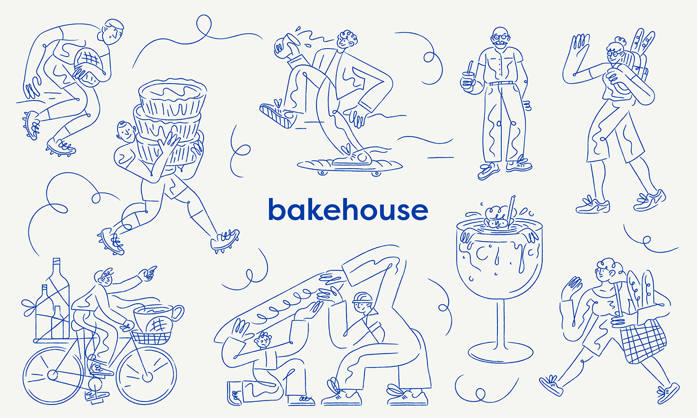
At the first stage of the project, I helped create a new logo mark which informed many decisions about updating the colours, type, packaging and photography. Additionally, I created illustrations that have been used across a significant scope of items within the visual Identity, including the packaging, merchandise, uniforms, menus and social media assets.
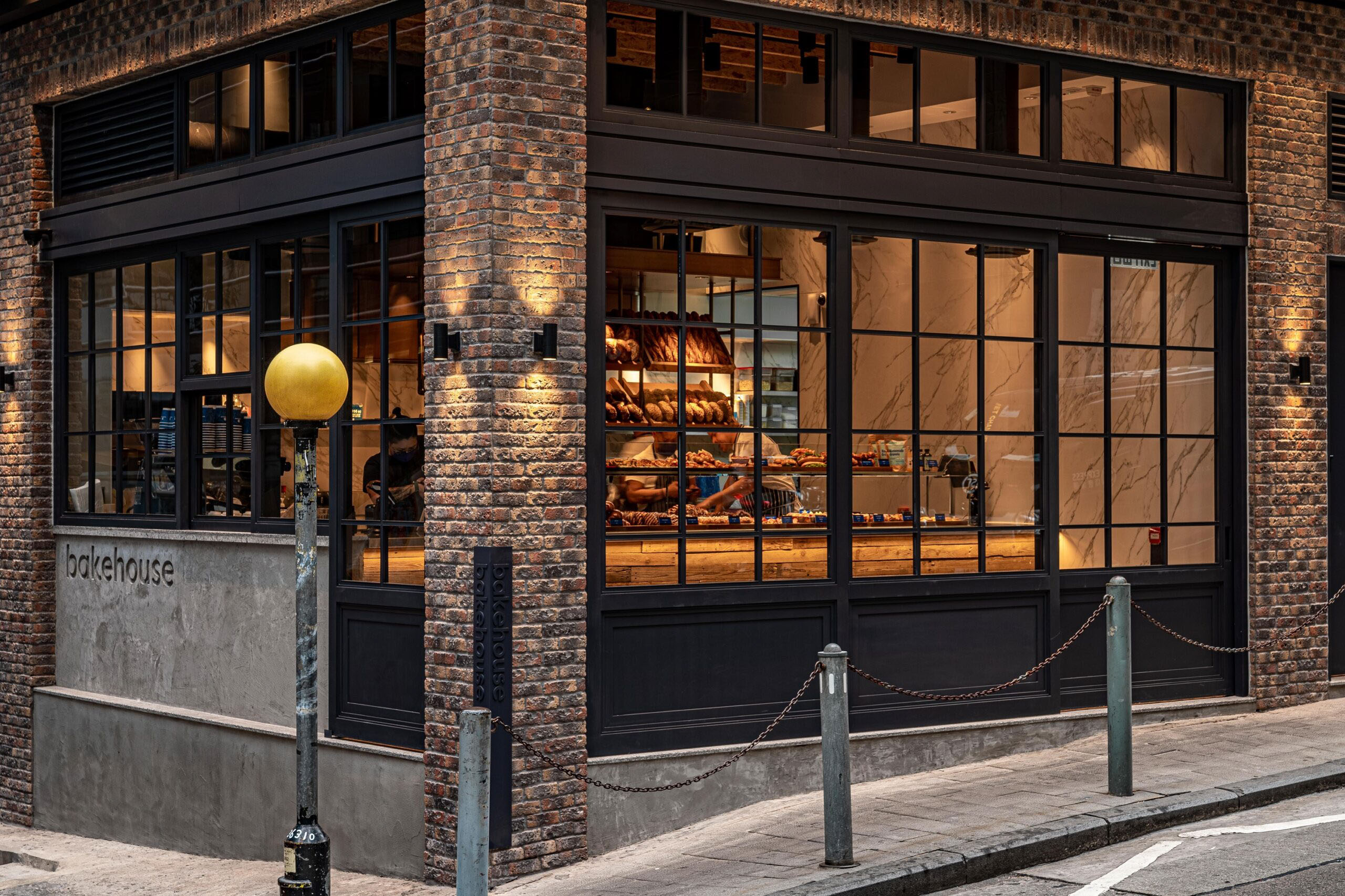
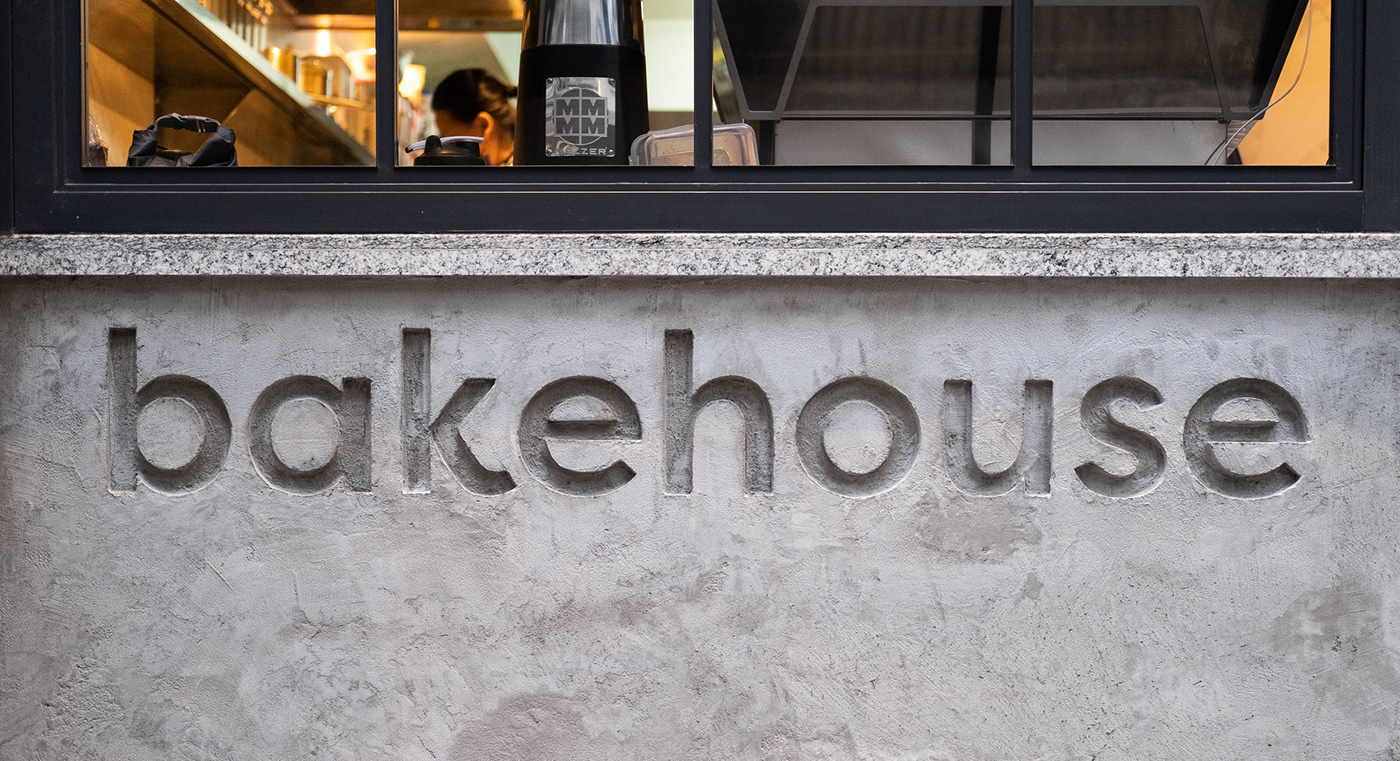
bakehouse was seeking a timeless “icon” that could grow to be recognisable without the bakery’s name present. The brick “B” logo mark is inspired by the iconic brick facade from their Wan Chai branch, and a matching facade was subsequently carried over to their new store in SOHO. To further solidify the logo concept, we later discovered that fresh boules of sourdough bread have often been referred to as “brique”, the French word for brick. The logotype was subtly reworked to include more quirk and energy in the letterforms, energy that was at the heart of bakehouse’s decision to rebrand.
The rebrand launched in tandem with the opening of bakehouse’s newest location in SOHO, Central Hong Kong, at the end of 2020.